-
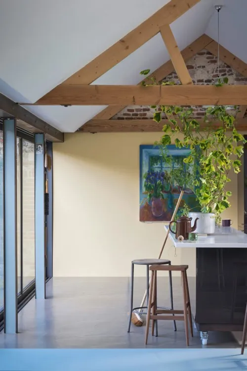
 Hay is a warm and dusty yellow with a distinct green undertone, evoking the freshness of the crop from which it takes its name. It's less intensely coloured than the sunny Yellow Ground, and therefore easier to use for those who love yellow but are nervous of strong wall colours.
 -
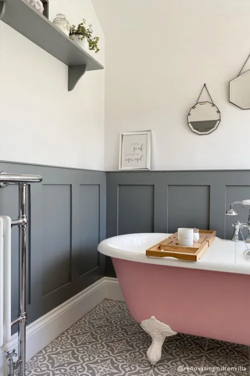
 Sitting between the ever-popular Railings and Down Pipe, this classic charcoal colour is inspired by the attractively designed iron containers used to catch rainwater at the top of a downpipe. Ideal for creating inviting spaces, Hopper Head works beautifully with nearly any Farrow & Ball shade or can be used exclusively across walls, woodwork and the ceiling for a dramatic space.
 -
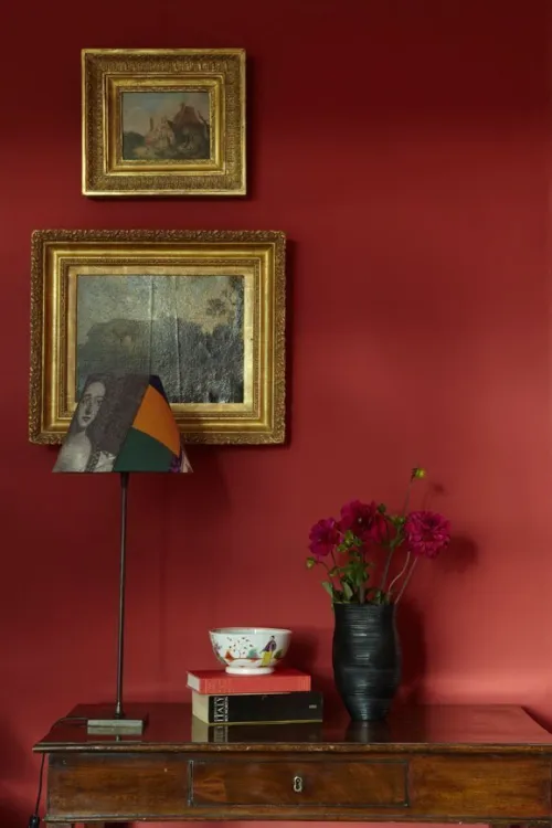
 Incarnadine is a rich crimson colour. Unashamedly glamorous, especially when used in Farrow & Ball Full Gloss, it can be used in a strong palette with Tanner's Brown woodwork or with a bright white, which will create a fresher feel.
 -

 Inchyra Blue was once a custom Farrow & Ball paint colour, created specially for Inchyra House in Perthshire. Its deep blue-grey tone takes its inspiration from wild and stormy Scottish skies, and is just as changeable as the weather in certain lights, it can take on a more blue, grey, or even green cast.
 -
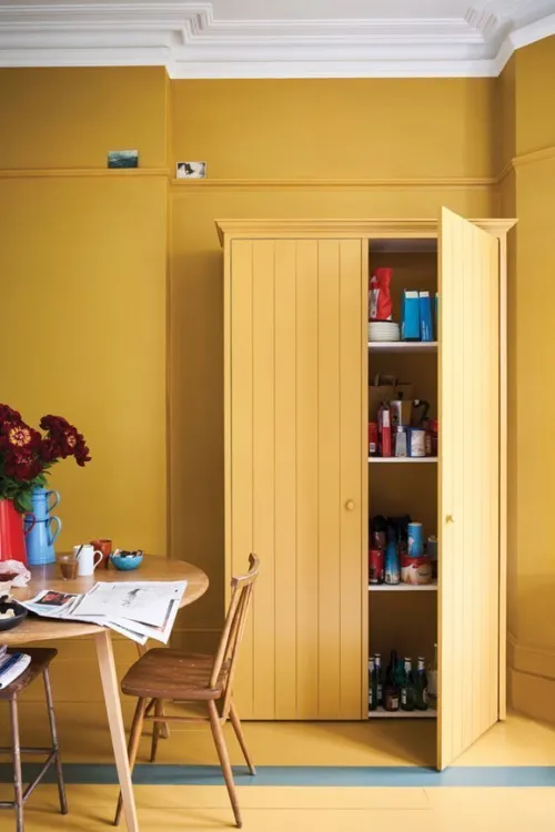
 India Yellow has an unusual source of inspiration, taking its name from a pigment traditionally collected from the urine of cows fed on mango leaves. It's a very modern yellow, thanks to its deep earthy tones, and looks just as good used in moderation as it does all over a smaller room to create a cosy escape.
 -
 James White was originally created for a Dr James, a discerning man whose garden room was in need of a lightly green-based white. The finished result is subtle and soothing, and looks particularly good in rooms that receive little natural light.
 -
 Jitney takes its name from the Hampton Jitney, the bus that whisks New Yorkers away from the stifling city and towards the sea air of the Hamptons during the summer months. This beachy destination inspired the colour of Jitney a relaxed and effortlessly cool sandy brown.
 -
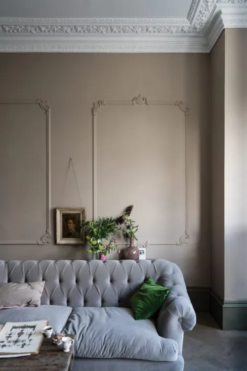
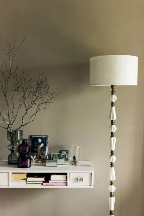
 Joa's White is named after Farrow & Ball's Colour Curator, Joa Studholme. A light taupe with just the slightest amount of black, this versatile shade from the Red Based Neutrals group looks particularly fitting alongside natural materials like leather, linen and stone.
 -


A clean light blue
This highly requested, cleaner interpretation of Light Blue takes its name from the folkloric fires of Sweden, often decorated in this shade. Recommended Primer & Undercoat: White and Light Tones Complementary white: Strong White No. 2001 -
 This clean cool blue is inspired by the wings of seabirds when seen in bright sunlight. Sitting between Parma Gray and Lulworth Blue, Kittiwake has a touch more black pigment creating a warmer, more relaxed feel. This shade is perfect for living spaces, staying truly blue in all lights. It also complements stainless steel especially well, so is ideal for contemporary kitchens. A sophisticated blue, it looks fantastic with Wine Dark and Borrowed Light.
 -
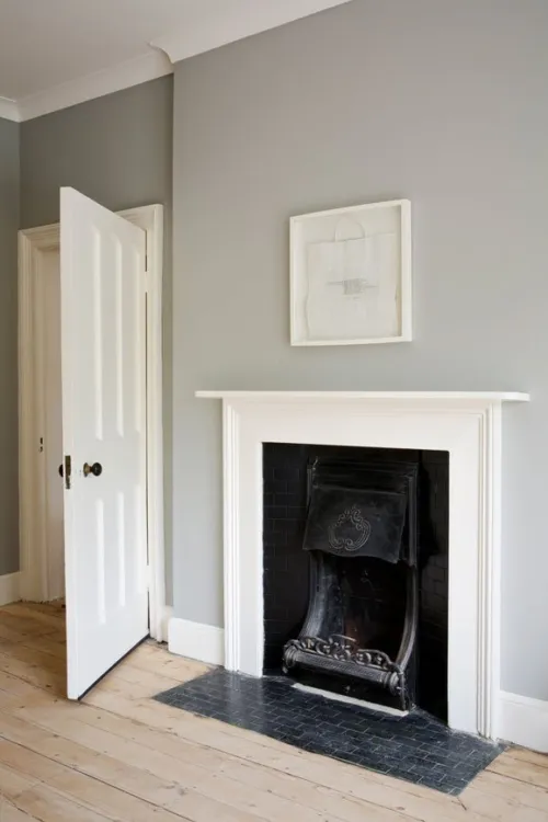
 Lamp Room Gray is a traditional blue-grey colour that creates timeless-feeling schemes. It's slightly softer than Pavilion Gray but still has a surprising amount of strength to it when used in smaller spaces.
 -
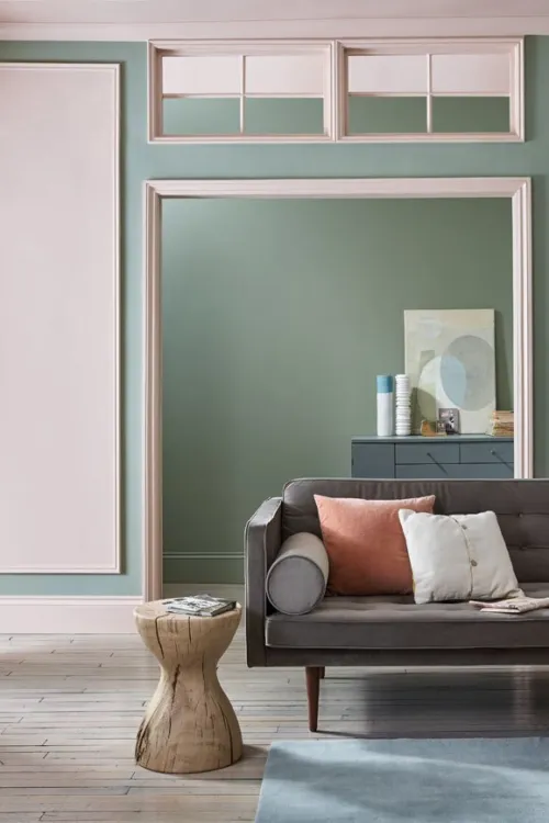
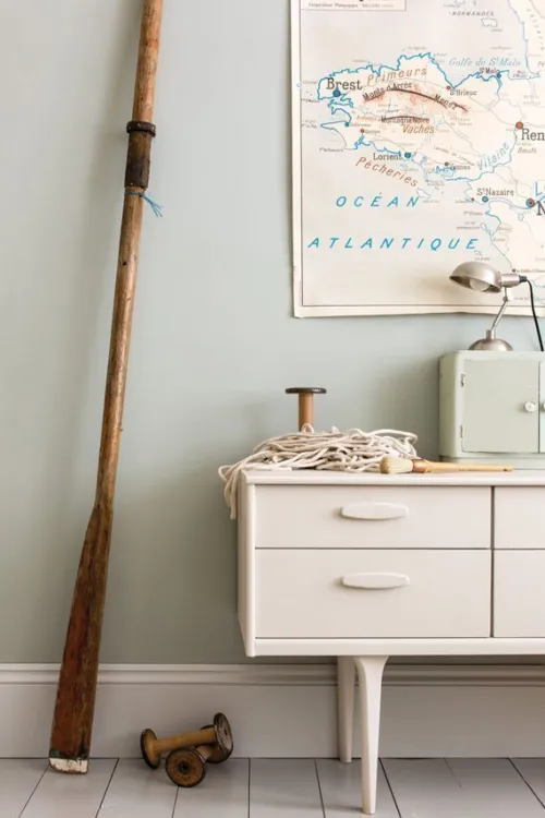
 Lichen is a muted shade of green that effortlessly evokes the subtle beauty of the natural world. It has a slight hint of blue to it, and works well in a scheme alongside the lighter Vert De Terre.
 -
 Light Blue is a long-standing Farrow & Ball favourite, having originally featured in the brand's first collection of colours. Its enduring popularity is largely thanks to its changeable nature, with its delicate silvery tones becoming more prominent in areas of low light.
 -
 The name 'Light Gray' was first used to describe colours in the 9th century, making this one of the most ancient inspirations for a Farrow & Ball colour. It has a slight green undertone that means it works particularly well with the Farrow & Ball Traditional Neutrals Group.
 -
 Lime White is an off-white shade inspired by traditional 'distemper' paints, whose recipes included ingredients derived from limestone. It features a very small amount of green pigment, which gives it an effortless softness.
 -
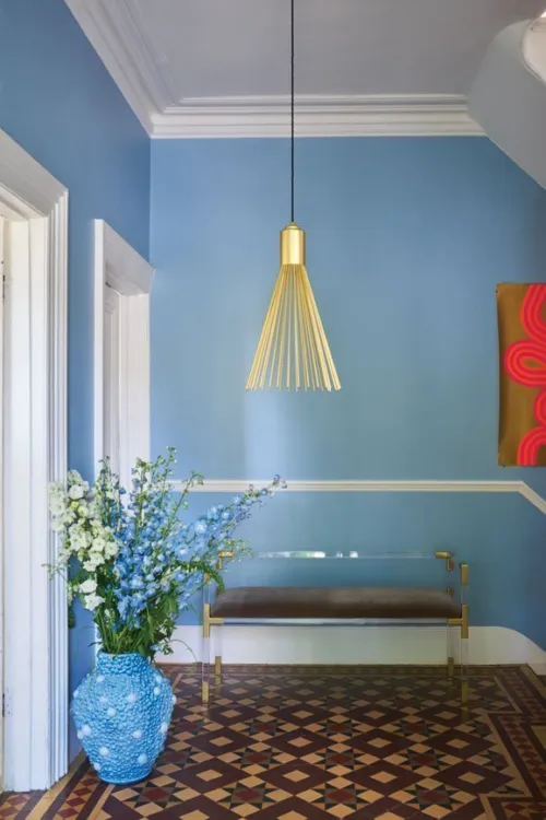
 Lulworth Blue is a colour typically found in Regency palettes, but with a nod to the ancient landscape around Farrow & Ball's home the Jurassic Coast in southern England. Bright yet peaceful, it's a wonderful option for a light and breezy bedroom.
 -


A grounded orange hue
Named after the marmelo quince, the inspiration for marmalade, this is a thoroughly comforting shade. Recommended Primer & Undercoat: Red and Warm Tones Complementary white: Joa's White No. 226 -
 Matchstick is a simple tone with a simple source of inspiration the humble kitchen match. The colour of unbleached wood, it's warm but not overly creamy, creating a fresh feel in rooms that receive a lot of natural light. Try it in a scheme with lighter yellow-based neutrals New White and White Tie.
 -
 Mizzle is a West Country dialect word for a mix of mist and drizzle. This evocative tone is a light and misty green-grey tone, without any coolness from blue undertones. Try it with the stronger Pigeon on trim for a cohesive look.
 -
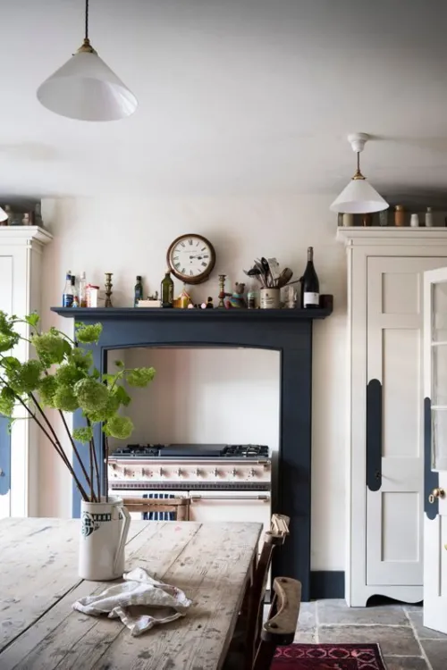
 Mole's Breath is a strong grey that makes a very versatile accent for other Farrow & Ball greys, whether an Easy Neutral like Wevet or a Contemporary Neutral like Strong White. Used on walls in a smaller room, it feels daring yet comforting. Or, try it on a kitchen island to make a statement against lighter grey cabinets.
 -
 Mouse's Back is a soft, quiet grey-brown inspired by the colour of the beloved British fieldmouse. It has a little green to it, which is especially prominent in rooms without much natural light, and works beautifully alongside other green-toned neutrals such as Lime White.
 -
 Nancy's Blushes takes its inspiration from a rosy-cheeked little girl named Nancy. Cheerful and uplifting, it nevertheless feels sophisticated when used alongside a soft neutral in a low-lit room. For a more impactful look, try it with the graphic St Giles Blue.
 -


A familiar terracotta
Inspired by the origins of the word apron, this is a familiar clay colour with a well-loved feel. Recommended Primer & Undercoat: Red and Warm Tones Complementary white: Stirabout No. 300 -
 With a less aged feel than more traditional Farrow & Ball neutrals, such as Lime White, New White creates fresh and warm interiors. It works wonders alongside its fellow Yellow Based Neutrals, Matchstick and String, especially in a country kitchen.
 -
 Off-White first appeared in the original palette of Farrow & Ball colours, making it a true classic. It still earns its keep in the palette today as part of the Traditional Neutrals group, alongside Old White, Slipper Satin and Lime White, which share its alluring green undertone.
Paint, Wallpaper and Decorating Supplies
From premium paint to stylish wallpaper, we’ve got everything you need to transform your space. For more than 20 years, P.V. Macari Interiors, based in Co. Armagh, we’re built on quality, value and service — trusted by pros and DIYers alike. As a family‑run business, we combine top‑quality products with genuine expertise to help you achieve the perfect finish.
Get Exclusive Discounts
Join our list for exclusive offers, early access to promotions, and helpful project inspiration.
We treat your information with care to keep it secure, and you can opt out at any time.
Copyright P.V. Macari Interiors
My Account
About & More
Payment
Checkout Powered by
