
-
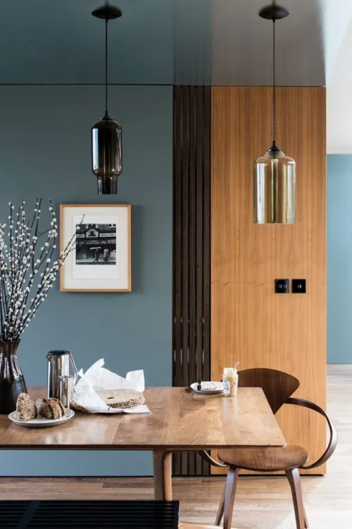
 Although popular in Regency-era colour palettes, the grey-blue shade of Farrow & Ball's De Nimes has its origins in something a little more modern: denim workwear. Like a favourite pair of jeans, it feels low-key but always stylish.
 -
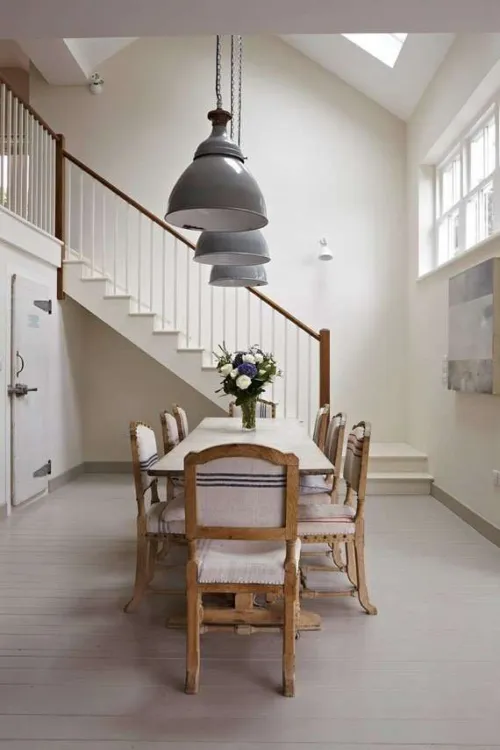
 Stirabout is inspired by the nurturing porridge favoured over many centuries in Ireland. An earthy tone with just a hint of underlying grey, it's perfect for creating a relaxed feel, which will never be too cold. Try pairing it with Jitney and natural fabrics for a laidback look.
 -
 A gentle green named after the circular currents enjoyed by wild water swimmers as a natural jacuzzi. This evocative colour creates a seamless connection with nature, perfect for use in a garden room or alongside natural materials. A breath of fresh air, Eddy is also an ideal choice for calm, relaxing spaces. It is delicate in tone without crossing into pastel and sits at the lightest end of the French Gray and Treron family.
 -
 The lightest and most delicate of our pinks, this charming colour is that of the tacking thread used in Haute Couture ateliers. It may be delicate but it's strong in character and has enough colour contrast with white. Perfect paired with vintage finds or industrial accents, this shade works well in both traditional and modern schemes.
 -
 A historic-feeling pink, this shade was developed for the dining room at Templeton House to offset the magnificent Wedgwood plaques made to commemorate the former owner, although it suits a contemporary setting just as well. A more intense version of Setting Plaster or Pink Ground, it creates a warm, welcoming space, particularly in low light where this shade becomes surprisingly deep.
 -
 Our most spirited red, the name of this fiery hue was originally used to describe the deceit of pirates. Full of buccaneering spirit, Bamboozle brings joy and warmth to any room scheme and is easy to use in both traditional and modern homes. It will hold its own in any light and pairs brilliantly with other strong colours, like Beverly and Wine Dark.
 -
 Sitting between the ever-popular Railings and Down Pipe, this classic charcoal colour is inspired by the attractively designed iron containers used to catch rainwater at the top of a downpipe. Ideal for creating inviting spaces, Hopper Head works beautifully with nearly any Farrow & Ball shade or can be used exclusively across walls, woodwork and the ceiling for a dramatic space.
 -
 A lighter, less grey version of popular De Nimes, Selvedge is named after the highly prized denim woven on a shuttle loom to produce closed edges. It's particularly good in low-light spaces, creating a familiar and friendly atmosphere, making it suited to bedrooms or rooms you spend time in, in the evening. It pairs beautifully with accents of darker colours like Inchyra Blue or Hopper Head.
 -
 This clean cool blue is inspired by the wings of seabirds when seen in bright sunlight. Sitting between Parma Gray and Lulworth Blue, Kittiwake has a touch more black pigment creating a warmer, more relaxed feel. This shade is perfect for living spaces, staying truly blue in all lights. It also complements stainless steel especially well, so is ideal for contemporary kitchens. A sophisticated blue, it looks fantastic with Wine Dark and Borrowed Light.
 -
 Inspired by midnight skies, this spiritual colour is named after the term Homer used to describe the sea. Our richest blue, it's the perfect addition to our strong blue family, being more sophisticated than Stiffkey Blue and more upbeat than Hague Blue. In low-light, Wine Dark becomes even richer, making it particularly glamorous in candlelight and perfect for creating intimate spaces.
 -
 For an upbeat space, try this lively green. A lighter version of Breakfast Room Green, Whirlybird is inspired by the papery winged seeds beloved by many playful young gardeners and nature lovers. It looks particularly lively in morning light and is complemented by Beverly and James White.
 -
 This clean mid green is named in honour of a kind and generous member of our Farrow & Ball team who is sadly no longer with us. A dependable, uncomplicated colour, with the ability to feel even greener in bright daylight or more conservative in lower light. This shade is a beautiful addition to any home.
 -


A softer salmon hue
This lighter interpretation of Dead Salmon is inspired by both the soft hue and gentle, curved shape of the prized shellfish. Recommended Primer & Undercoat: Mid Tones Complementary white: Dimity No. 2008 -


A down-to-earth green
Named after the tool beloved by gardeners to create holes for planting seeds or bulbs, this muddied green has a close association with the natural world. Recommended Primer & Undercoat: Dark Tones Complementary white: Slipper Satin No. 2004 -


An intense muddied green
The green pigment in this dark neutral has been reduced so much that it's barely there - some see brown, while others see green. Recommended Primer & Undercoat: Dark Tones Complementary white: Old White No. 4 -


A crisp, blue-based neutral
A fresh neutral with distinctive blue undertones, this colour has a certain crispness like the starch it is named after. Recommended Primer & Undercoat: White and Light Tones Complementary white: All White No. 2005 -


A familiar terracotta
Inspired by the origins of the word apron, this is a familiar clay colour with a well-loved feel. Recommended Primer & Undercoat: Red and Warm Tones Complementary white: Stirabout No. 300 -


A grounded orange hue
Named after the marmelo quince, the inspiration for marmalade, this is a thoroughly comforting shade. Recommended Primer & Undercoat: Red and Warm Tones Complementary white: Joa's White No. 226 -


A clean light blue
This highly requested, cleaner interpretation of Light Blue takes its name from the folkloric fires of Sweden, often decorated in this shade. Recommended Primer & Undercoat: White and Light Tones Complementary white: Strong White No. 2001 -


A smoky grey-green
Inspired by the soot and tarnished brass of traditional candle snuffers, this is a green interpretation of our beloved Inchyra Blue. Recommended Primer & Undercoat: Dark Tones Complementary white: Shaded White No. 201 -


A deep ochre
An aged yellow celebrating the ever so familiar cloth used to clean homes worldwide. Recommended Primer & Undercoat: Mid Tones Complementary white: Lime White No. 1 -
 Strong White is a light neutral shade that sits somewhere between a white and a pale grey. It has a very subtle lilac undertone shared by the rest of the Farrow & Ball Contemporary Neutrals, which all partner brilliantly with Strong White to create a contemporary scheme with just a hint of warmth.
 -
 White Tie is a pretty, traditional white with a yellow base. As a wall colour, it imparts a gentle warmth to any space, with just a hint of black pigment adding a surprising depth. Used alongside other shades from the Farrow & Ball Yellow Based Neutrals, like the darker Matchstick and String, it creates a delicately creamy scheme.
 -
 Pointing is a pale yet warm white from the Farrow & Ball Red Based Neutrals group, named after the mortar used in traditional brickwork. It makes a sympathetic addition to any scheme that uses strong, traditional colours, where a bright white might feel too high-contrast.
 -
 Slipper Satin is a delicate off-white shade inspired by the silky fabric of traditional ballet slippers. It has a chalky, almost greyed tone that sits wonderfully alongside Farrow & Ball Old White on woodwork, or with other Traditional Neutrals such as Off-White or Lime White, to create a subtle and timeless scheme.
 -
 All White is a clean and simple bright white. As its name suggests, it contains no pigments of any other colour. It's softer than standard brilliant whites, which often appear cooler due to the inclusion of blue pigment. Combine All White with the bold Charlotte's Locks for a clean and graphic feel, or with paler tones Pavilion Blue, Cooking Apple Green, or Middleton Pink to create a sense of freshness and light.
 -
 Great White is a white with just a hint of pink. Its subtlety makes it a wonderful wall colour for children's rooms, offering the delicate sweetness of a pale lilac-pink with the versatility and sophistication of a neutral. Its undertone also makes it a natural partner for stronger pinks such as Rangwali.
 -
 Dimity is a pale taupe with a subtle red base, named after a sheer cotton fabric popular in dressmaking. It has a great amount of warmth and depth, making for instantly welcoming hallways and living rooms. When paired with Pointing, it seems to take on a pinkier tone, while combining it with darker Oxford Stone creates a more aged look.
 -
 James White was originally created for a Dr James, a discerning man whose garden room was in need of a lightly green-based white. The finished result is subtle and soothing, and looks particularly good in rooms that receive little natural light.
 -
 Blackened is the Farrow & Ball white with the coolest undertones. Its hint of grey would have traditionally come from 'lamp black' pigment made from residual soot from burning oil lamps hence the name. It creates a minimal, contemporary feel, and can look especially at home in an industrial-style scheme.
 -
 Matchstick is a simple tone with a simple source of inspiration the humble kitchen match. The colour of unbleached wood, it's warm but not overly creamy, creating a fresh feel in rooms that receive a lot of natural light. Try it in a scheme with lighter yellow-based neutrals New White and White Tie.
Paint, Wallpaper and Decorating Supplies
From premium paint to stylish wallpaper, we’ve got everything you need to transform your space. For more than 20 years, P.V. Macari Interiors, based in Co. Armagh, we’re built on quality, value and service — trusted by pros and DIYers alike. As a family‑run business, we combine top‑quality products with genuine expertise to help you achieve the perfect finish.
Get Exclusive Discounts
Join our list for exclusive offers, early access to promotions, and helpful project inspiration.
We treat your information with care to keep it secure, and you can opt out at any time.
Copyright P.V. Macari Interiors
My Account
About & More
Payment
Checkout Powered by
