-
 Cromarty is a very light green with a noticable grey undertone. Almost neutral in its softness, it makes a relaxed yet atmospheric addition to any room, especially when paired with the darker Blue Gray or Pigeon on woodwork.
 -
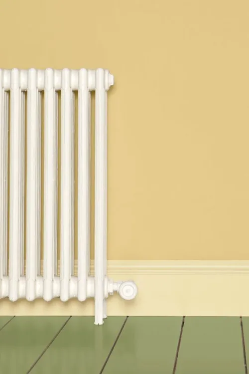
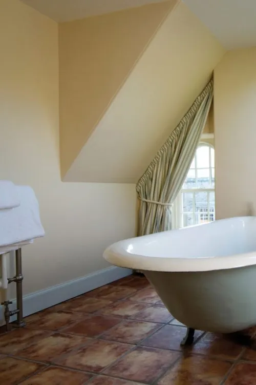
 Dayroom Yellow is a refreshing pale yellow inspired by a Regency palette. It's best used in rooms that receive a lot of sun like the dayrooms from which it takes its name where its cheerful yellow shade will amplify the available light even more.
 -
 Although popular in Regency-era colour palettes, the grey-blue shade of Farrow & Ball's De Nimes has its origins in something a little more modern: denim workwear. Like a favourite pair of jeans, it feels low-key but always stylish.
 -
 Dead Salmon is a deep salmon pink, and one of Farrow & Ball's most complex shades. It's discernibly rosy in some lights, while its brown and warm grey tones come out more strongly in others. It's a flattering backdrop for any space, but looks particularly beautiful in candlelight great for a dining room.
 -


A down-to-earth green
Named after the tool beloved by gardeners to create holes for planting seeds or bulbs, this muddied green has a close association with the natural world. Recommended Primer & Undercoat: Dark Tones Complementary white: Slipper Satin No. 2004 -
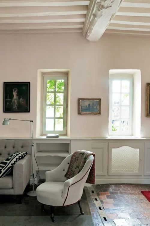
 Dimity is a pale taupe with a subtle red base, named after a sheer cotton fabric popular in dressmaking. It has a great amount of warmth and depth, making for instantly welcoming hallways and living rooms. When paired with Pointing, it seems to take on a pinkier tone, while combining it with darker Oxford Stone creates a more aged look.
 -
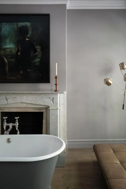
 A cool and delicate grey. This cool grey is named after the quaint West Country dialect for the colour of twilight.
 -
 Dix Blue is a vintage-inspired blue paint colour with generous doses of green and black pigment, which give it a complex, slightly aged appearance. It takes its name from one of the first Farrow & Ball stockists, based in the east of England.
 -
 Dorset Cream is a traditional shade the exact colour of rich double cream, which is commonly made around Farrow & Ball's home in the south-west of England. It's a darker yellow than Farrow's Cream, best used with other yellow-based neutrals such as New White.
 -


A smoky grey-green
Inspired by the soot and tarnished brass of traditional candle snuffers, this is a green interpretation of our beloved Inchyra Blue. Recommended Primer & Undercoat: Dark Tones Complementary white: Shaded White No. 201 -
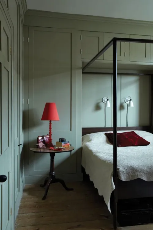
 Dove Tale is a warm mid-tone grey, perfect as a darker accent or alternative to Elephant's Breath. Its subtle lilac undertone gives it a soft and restful feel that suits bedrooms beautifully, especially when paired with Skimming Stone.
 -
 Down Pipe is a true Farrow & Ball classic. A deep lead grey with a blue undertone, it creates a strong but complex finish on all sorts of surfaces, whether as a backdrop to your favourite gallery wall, a skirting board colour that ties every room together, or even a dramatic shade for floorboards.
 -
 Drop Cloth is a mid grey beige or 'greige' that pays homage to our expert painters and decorators. It takes its name from the indispensable dust sheet, and is just as useful, creating the perfect neutral base for lighter tones like Shaded White and Shadow White.
 -


A deep ochre
An aged yellow celebrating the ever so familiar cloth used to clean homes worldwide. Recommended Primer & Undercoat: Mid Tones Complementary white: Lime White No. 1 -
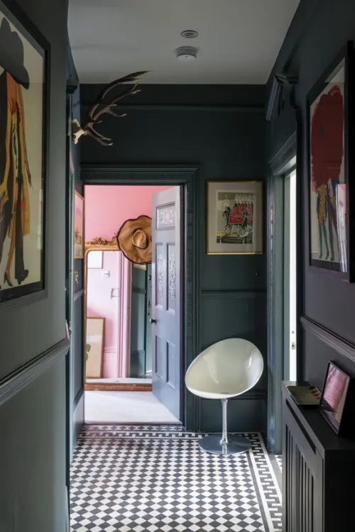
 Eating Room Red is a deep, blackened burgundy shade that takes its name from the dining rooms of the mid-19th century, where damask wallpapers of this exact colour were a popular feature.
 -
 A gentle green named after the circular currents enjoyed by wild water swimmers as a natural jacuzzi. This evocative colour creates a seamless connection with nature, perfect for use in a garden room or alongside natural materials. A breath of fresh air, Eddy is also an ideal choice for calm, relaxing spaces. It is delicate in tone without crossing into pastel and sits at the lightest end of the French Gray and Treron family.
 -

 Elephant's Breath is instantly recognisable as a Farrow & Ball shade, both in name and colour. It's a universally popular mid-tone grey with a subtle lilac undertone, which comes more to the fore in cooler light. Try it in a scheme alongside the darker Charleston Gray and London Clay for an effortlessly cool look.
 -


A brown-based deep red
An earthy red inspired by an ancient civilisation. Less intense than Preference Red, it's still undoubtedly rich without being overwhelming. Recommended Primer & Undercoat: Red and Warm Tones Complementary white: Joa's White No. 226 -
 The first cream to feature in the Farrow & Ball palette is aptly named after the brand's co-founder, John Farrow. A classic wall colour, with no complexity-adding black pigment, Farrow's Cream creates pretty and traditional-feeling rooms. It looks particularly at home in a country kitchen.
 -
 French Gray, despite its name, leans heavily towards green. A beautifully subtle and indeterminate shade, it takes its inspiration from colours popular in French decoration in the 19th century, and creates very relaxed-feeling rooms. Its green undertone makes it a sympathetic colour for exterior woodwork, especially front doors.
 -
 Great White is a white with just a hint of pink. Its subtlety makes it a wonderful wall colour for children's rooms, offering the delicate sweetness of a pale lilac-pink with the versatility and sophistication of a neutral. Its undertone also makes it a natural partner for stronger pinks such as Rangwali.
 -
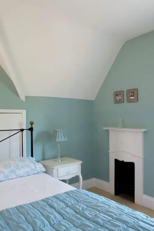
 No colour has provoked more debate among Farrow & Ball's followers than Green Blue. It appears differently to everyone and changes colour with the light, adding intrigue to any room but all are sure to agree on its soft, aquatic tones, which are particularly perfect for a relaxing bathroom.
 -
 Green Smoke is one of Farrow & Ball's most versatile greens, working just as well on kitchen cabinets and panelling as it does on walls. It's a deep and smoky shade with a generous dose of blue pigment, inspired by the interiors of the late 19th century.
 -
 Hague Blue is a fantastically popular Farrow & Ball blue, a deep and inky favourite for walls, woodwork, and front doors alike. Try it as a darker accent to Borrowed Light, or all over for rooms that make a real statement.
 -
 Hardwick White is one of the deepest and most grey-toned of the Farrow & Ball whites. Used as a wall colour, it's a sophisticated chalky hue that appears much more grey than white. Contrasted with a strong shade such as Off-Black, meanwhile, it appears much brighter.
Paint, Wallpaper and Decorating Supplies
From premium paint to stylish wallpaper, we’ve got everything you need to transform your space. For more than 20 years, P.V. Macari Interiors, based in Co. Armagh, we’re built on quality, value and service — trusted by pros and DIYers alike. As a family‑run business, we combine top‑quality products with genuine expertise to help you achieve the perfect finish.
Get Exclusive Discounts
Join our list for exclusive offers, early access to promotions, and helpful project inspiration.
We treat your information with care to keep it secure, and you can opt out at any time.
Copyright P.V. Macari Interiors
My Account
About & More
Payment
Checkout Powered by
