
-
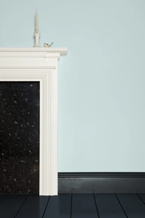
 Lime White is an off-white shade inspired by traditional 'distemper' paints, whose recipes included ingredients derived from limestone. It features a very small amount of green pigment, which gives it an effortless softness.
 -
 Off-White first appeared in the original palette of Farrow & Ball colours, making it a true classic. It still earns its keep in the palette today as part of the Traditional Neutrals group, alongside Old White, Slipper Satin and Lime White, which share its alluring green undertone.
 -
 Old White, quite simply, is the most historic of Farrow & Ball whites. It's part of the Traditional Neutrals group Lime White, Off-White, Old White and Slipper Satin the shades of which all share a subtle green undertone. This tone is particularly prominent in north-facing rooms, but is downplayed in well-lit spaces, making Old White appear as more of a grey.
 -
 Hardwick White is one of the deepest and most grey-toned of the Farrow & Ball whites. Used as a wall colour, it's a sophisticated chalky hue that appears much more grey than white. Contrasted with a strong shade such as Off-Black, meanwhile, it appears much brighter.
 -
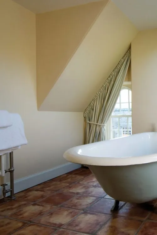
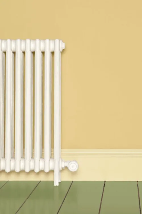
 String is one of Farrow & Ball's Yellow Based Neutrals, an earthy cream colour with an underlying hint of green. This green undertone makes it especially well-suited to rooms that connect to or look out onto a garden, where it subtly mimics any greenery outside.
 -
 Cord is a strong, yellow based neutral. It makes the perfect partner for Farrow & Ball classic String, having been created as its stronger accent. As a kitchen cabinet colour, it also works brilliantly with the slightly lighter Matchstick on walls.
 -
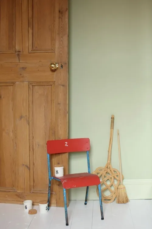
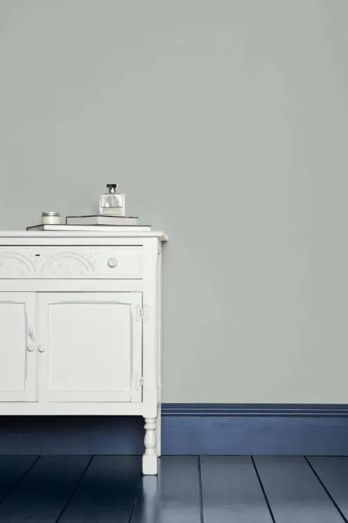
 The name 'Light Gray' was first used to describe colours in the 9th century, making this one of the most ancient inspirations for a Farrow & Ball colour. It has a slight green undertone that means it works particularly well with the Farrow & Ball Traditional Neutrals Group.
 -
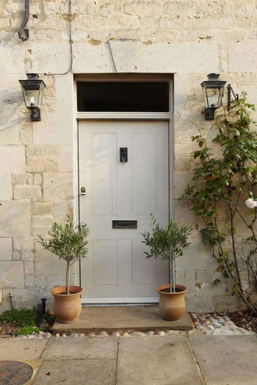
 French Gray, despite its name, leans heavily towards green. A beautifully subtle and indeterminate shade, it takes its inspiration from colours popular in French decoration in the 19th century, and creates very relaxed-feeling rooms. Its green undertone makes it a sympathetic colour for exterior woodwork, especially front doors.
 -
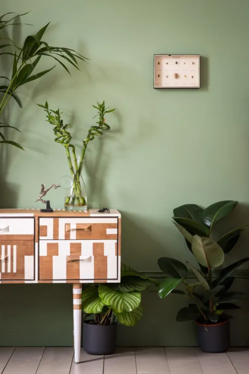
 Lichen is a muted shade of green that effortlessly evokes the subtle beauty of the natural world. It has a slight hint of blue to it, and works well in a scheme alongside the lighter Vert De Terre.
 -
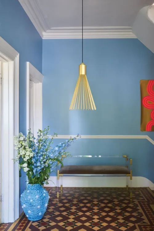
 Light Blue is a long-standing Farrow & Ball favourite, having originally featured in the brand's first collection of colours. Its enduring popularity is largely thanks to its changeable nature, with its delicate silvery tones becoming more prominent in areas of low light.
 -
 Pigeon is a deep yet soft blue-grey shade inspired by what else? the head and neck plumage of the humble pigeon. It's the ideal alternative to a truer grey such as Mole's Breath in spaces where a little more softness or warmth is needed, and it looks fantastic paired with pale grey Dimpse.
 -
 Down Pipe is a true Farrow & Ball classic. A deep lead grey with a blue undertone, it creates a strong but complex finish on all sorts of surfaces, whether as a backdrop to your favourite gallery wall, a skirting board colour that ties every room together, or even a dramatic shade for floorboards.
 -
 Parma Gray is in fact a cool blue with a distinct period feel. Paired with a bright white on woodwork, it can feel very traditional. With darker accents of navy Stiffkey Blue, however, it takes on a more contemporary look.
 -
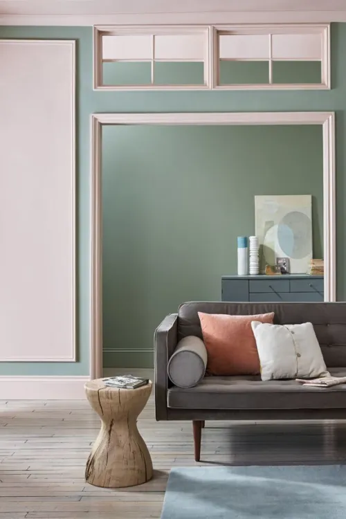
 Dead Salmon is a deep salmon pink, and one of Farrow & Ball's most complex shades. It's discernibly rosy in some lights, while its brown and warm grey tones come out more strongly in others. It's a flattering backdrop for any space, but looks particularly beautiful in candlelight great for a dining room.
 -
 Hague Blue is a fantastically popular Farrow & Ball blue, a deep and inky favourite for walls, woodwork, and front doors alike. Try it as a darker accent to Borrowed Light, or all over for rooms that make a real statement.
 -
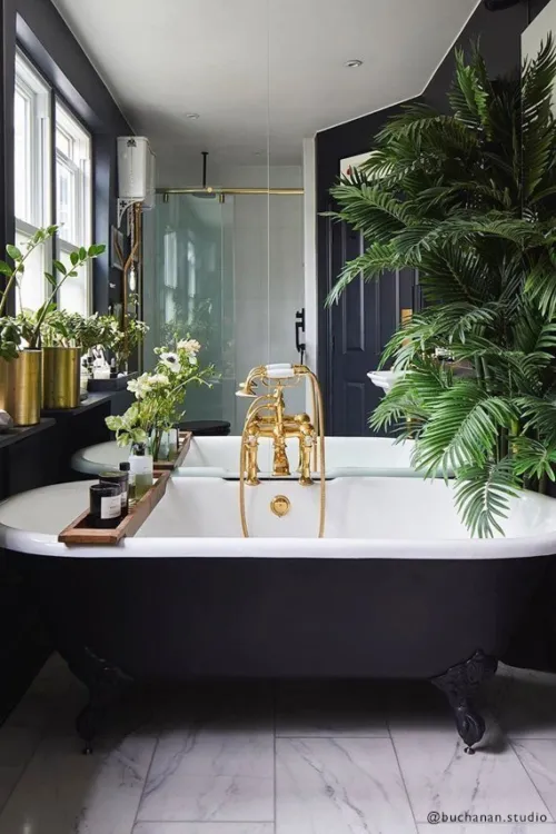
 Railings is a blue-based shade of black, appearing more blue or more discernibly black depending on the light. It's a great favourite for kitchen cabinets, to which it brings a very modern feel, as well as for walls in smaller rooms whose owners are looking for a bold and sophisticated statement shade.
 -
 Cooking Apple Green is a classic Farrow & Ball shade with a comforting traditional feel, especially when combined with All White woodwork. It's a versatile shade that feels fresh in brightly lit rooms and richer in low-lit spaces.
 -
 Calke Green is named after Calke Abbey, the country house in Derbyshire where an aged version of this rich green colour was originally found. As a wall colour, it works particularly well with Old White on ceilings and woodwork.
 -
 Hay is a warm and dusty yellow with a distinct green undertone, evoking the freshness of the crop from which it takes its name. It's less intensely coloured than the sunny Yellow Ground, and therefore easier to use for those who love yellow but are nervous of strong wall colours.
 -
 Mouse's Back is a soft, quiet grey-brown inspired by the colour of the beloved British fieldmouse. It has a little green to it, which is especially prominent in rooms without much natural light, and works beautifully alongside other green-toned neutrals such as Lime White.
 -
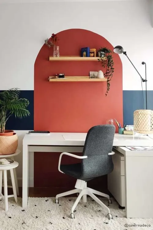
 The space from which this rich red takes its name is the impressive gallery at Attingham Park, a country house estate in the English county of Shropshire. Picture Gallery Red has a great deal of brown pigment to it, creating a depth and warmth that serves as the perfect backdrop to your favourite artworks.
 -
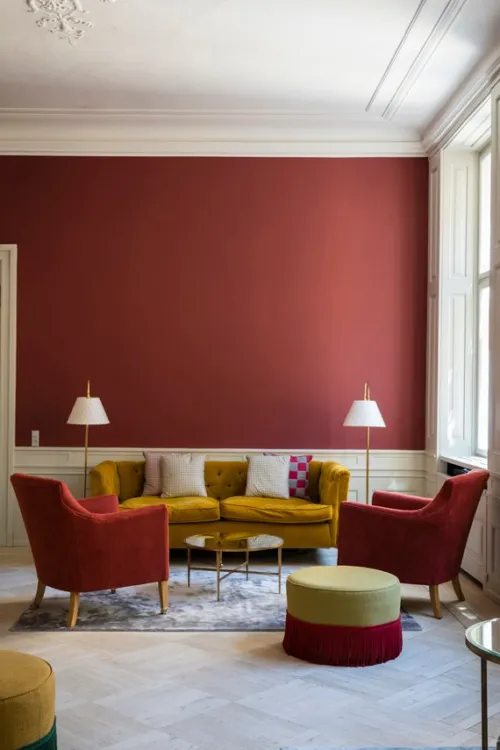
 Eating Room Red is a deep, blackened burgundy shade that takes its name from the dining rooms of the mid-19th century, where damask wallpapers of this exact colour were a popular feature.
 -
 Green Smoke is one of Farrow & Ball's most versatile greens, working just as well on kitchen cabinets and panelling as it does on walls. It's a deep and smoky shade with a generous dose of blue pigment, inspired by the interiors of the late 19th century.
 -
 Sudbury Yellow is a soft, mid-toned yellow that even for a Farrow & Ball colour responds in a particularly extraordinary way to changing light. In light-filled rooms it is a clean, bright yellow shade, while darker rooms will give it more softness.
 -


A brown-based deep red
An earthy red inspired by an ancient civilisation. Less intense than Preference Red, it's still undoubtedly rich without being overwhelming. Recommended Primer & Undercoat: Red and Warm Tones Complementary white: Joa's White No. 226 -
 Off-Black is quite simply what it says: a softer alternative to a true, pitch black for front doors, woodwork, and for the daring the walls of any small space crying out for a bit of character.
 -
 With a less aged feel than more traditional Farrow & Ball neutrals, such as Lime White, New White creates fresh and warm interiors. It works wonders alongside its fellow Yellow Based Neutrals, Matchstick and String, especially in a country kitchen.
 -
 Red Earth contains a blend of red and yellow pigments, both of which come together to create a terracotta tone of enormous warmth. It's a rich and earthy colour that suits homes both old and new, particularly in smaller spaces, where it feels inviting and enveloping.
 -
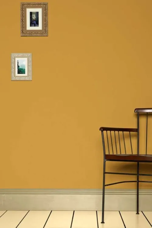
 India Yellow has an unusual source of inspiration, taking its name from a pigment traditionally collected from the urine of cows fed on mango leaves. It's a very modern yellow, thanks to its deep earthy tones, and looks just as good used in moderation as it does all over a smaller room to create a cosy escape.
 -
 The first cream to feature in the Farrow & Ball palette is aptly named after the brand's co-founder, John Farrow. A classic wall colour, with no complexity-adding black pigment, Farrow's Cream creates pretty and traditional-feeling rooms. It looks particularly at home in a country kitchen.
 -
 Dorset Cream is a traditional shade the exact colour of rich double cream, which is commonly made around Farrow & Ball's home in the south-west of England. It's a darker yellow than Farrow's Cream, best used with other yellow-based neutrals such as New White.
 -
 Breakfast Room Green is a cheerful mid-toned green that stays looking lively in all different lights. It's particularly striking in the early morning, when the users of east facing 'Breakfast Rooms' would traditionally have seen it.
 -
 Dix Blue is a vintage-inspired blue paint colour with generous doses of green and black pigment, which give it a complex, slightly aged appearance. It takes its name from one of the first Farrow & Ball stockists, based in the east of England.
 -
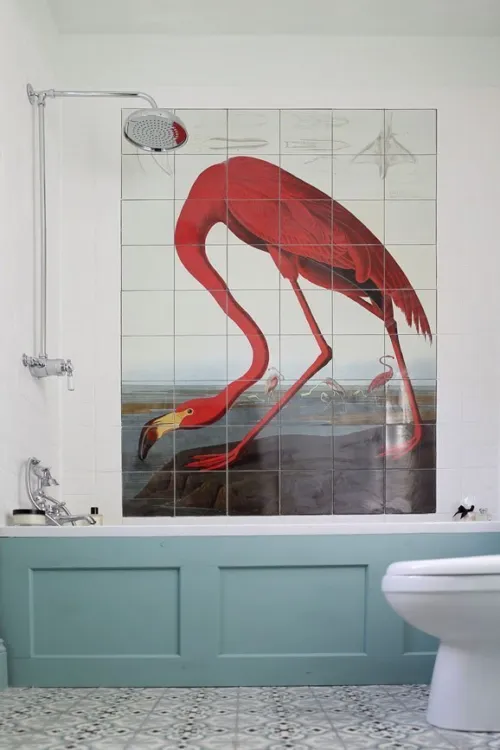
 No colour has provoked more debate among Farrow & Ball's followers than Green Blue. It appears differently to everyone and changes colour with the light, adding intrigue to any room but all are sure to agree on its soft, aquatic tones, which are particularly perfect for a relaxing bathroom.
 -
 Oval Room Blue is the most "blackened" of Farrow & Ball blues, containing a generous amount of the black pigment that gives many Farrow & Ball colours their earthy, lived-in feel. It sits beautifully in a scheme alongside greys, creating rooms of depth and balance.
 -
 Stone Blue is a cheerful and lively mid-toned blue, just as at home on a feature wall or piece of furniture as it is when used from floor to ceiling. Try it with deep purple colour Pelt for an unexpected combination with a vintage feel, or with the pale neutral tones of Dimpse for a more traditional look.
 -
 Lamp Room Gray is a traditional blue-grey colour that creates timeless-feeling schemes. It's slightly softer than Pavilion Gray but still has a surprising amount of strength to it when used in smaller spaces.
 -
 Lulworth Blue is a colour typically found in Regency palettes, but with a nod to the ancient landscape around Farrow & Ball's home the Jurassic Coast in southern England. Bright yet peaceful, it's a wonderful option for a light and breezy bedroom.
 -
 Blue Gray isn't quite as simple as its name suggests, appearing more blue, grey, or even green depending on the light. A small amount of black pigment gives it a relaxed, almost weathered feel. Try it as a less intense version of French Gray.
 -
 Studio Green is the darkest green in the Farrow & Ball palette, taken from the studio in which the company's original palette of colours was mixed. When used outdoors, it takes on a much greener hue, while indoors it can appear almost black.
 -


A quiet dark stone
A dark, quiet colour that sits effortlessly alongside natural materials, such as weathered wood or flagstone floors. It feels reserved and comforting in equal measure. Recommended Primer & Undercoat: Dark Tones Complementary white: Stirabout No. 300 -


A true earthy green
An enticing olive shade, Sap Green is a true celebration of nature and feels wonderfully intense in small spaces. Recommended Primer & Undercoat: Dark Tones Complementary white: Strong White No. 2001 -
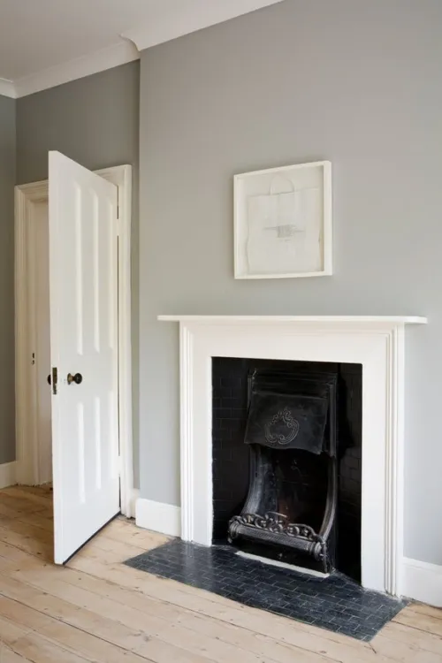
 Shaded White is neither warm nor cool more of a true neutral white that always seems as if it's being viewed in deep shade. It's an incredibly versatile neutral for walls and woodwork alike, especially when paired with the darker Drop Cloth to create a relaxed yet sophisticated feel.
 -
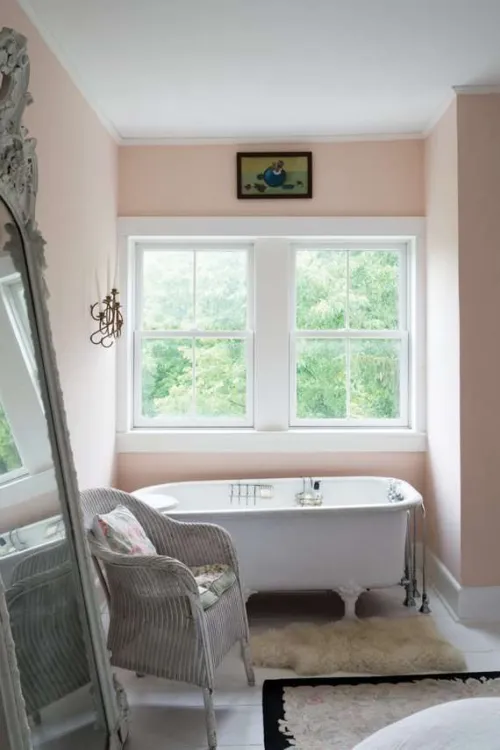
 Like Yellow Ground and Blue Ground, this soft and dusty pink was originally used as a background colour for Farrow & Ball wallpapers, until by popular demand it became a paint colour in its own right. It is light and delicate yet loaded with warmth thanks to a generous amount of yellow pigment.
 -
 Tallow is a creamy yellow-based white, taking its name from the natural material once used to make soaps and candles. Its underlying pink and yellow pigments give it a warm and reflective quality that helps to make the most of any available light.
 -
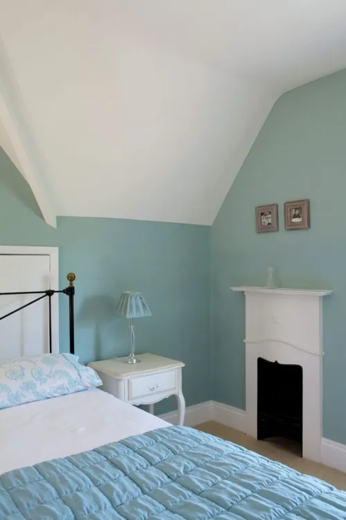
 Pale Powder is a pale aqua colour, developed as a lighter version of Farrow & Ball Archive colour Powder Blue. With its underlying hint of green pigment, it never feels cold, despite having the tendency to appear almost grey in north-facing rooms.
 -
 Skylight is a pale and delicate shade that shifts beautifully between grey and blue depending on the light. In smaller spaces, it's cooler and more overtly blue, while large and airy spaces will give it a paler and greyer feel.
 -
 Stony Ground started life as an incredibly popular Farrow & Ball wallpaper colour, and today is a welcome addition to its range of neutral paint colours. It's a traditional stony beige with a slight hint of red, which gives it a subtle warmth and tangible depth.
 -
 Arsenic is a vivid mint green that instantly enlivens any surface, whether it be furniture, front door, or feature wall. Try it in a 1960s-inspired palette with Nancy's Blushes and All White.
 -
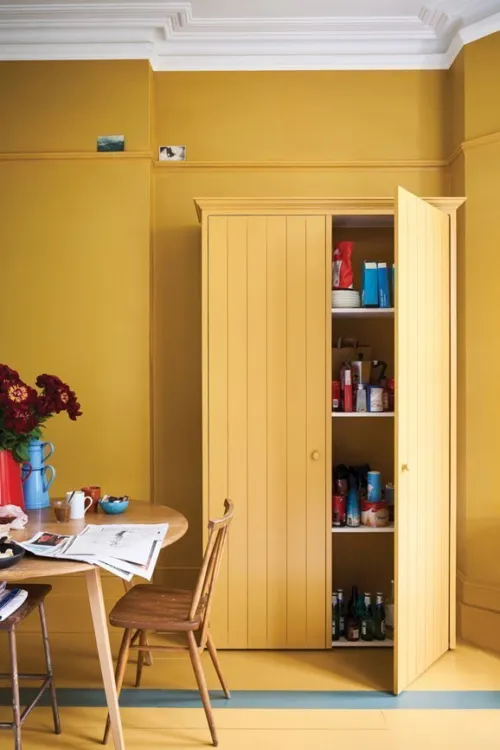
 Yellow Ground was originally used as a background colour to Farrow & Ball wallpapers, and today is one of its most popular yellows. Lighter than Sudbury Yellow and warmer than Citron, it's a true sunny yellow that creates discernibly happy spaces without ever feeling overpowering.
Paint, Wallpaper and Decorating Supplies
From premium paint to stylish wallpaper, we’ve got everything you need to transform your space. For more than 20 years, P.V. Macari Interiors, based in Co. Armagh, we’re built on quality, value and service — trusted by pros and DIYers alike. As a family‑run business, we combine top‑quality products with genuine expertise to help you achieve the perfect finish.
Get Exclusive Discounts
Join our list for exclusive offers, early access to promotions, and helpful project inspiration.
We treat your information with care to keep it secure, and you can opt out at any time.
Copyright P.V. Macari Interiors
My Account
About & More
Payment
Checkout Powered by
