
-
 Pointing is a pale yet warm white from the Farrow & Ball Red Based Neutrals group, named after the mortar used in traditional brickwork. It makes a sympathetic addition to any scheme that uses strong, traditional colours, where a bright white might feel too high-contrast.
 -
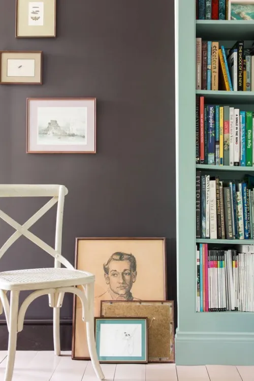
 Oxford Stone is a deeper shade of taupe belonging to the Farrow & Ball Red Based Neutrals. The darkest in the group, it sits contentedly alongside the lighter Dimity and Joa's White for an all-neutral look with a tangible warmth.
 -
 Drop Cloth is a mid grey beige or 'greige' that pays homage to our expert painters and decorators. It takes its name from the indispensable dust sheet, and is just as useful, creating the perfect neutral base for lighter tones like Shaded White and Shadow White.
 -
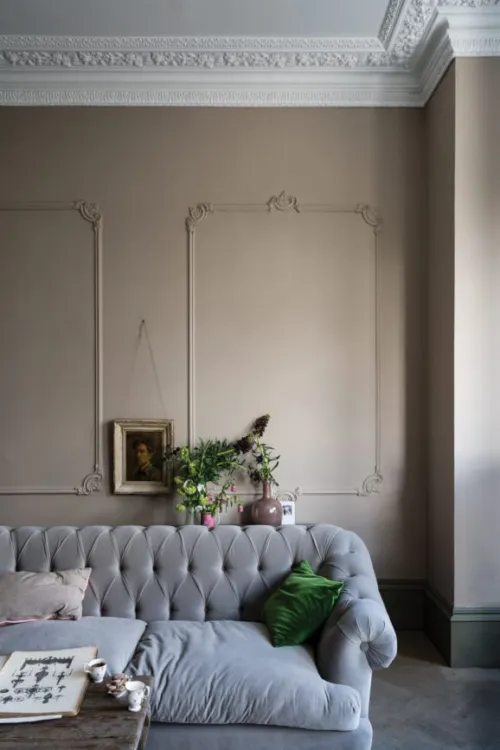
 Dimity is a pale taupe with a subtle red base, named after a sheer cotton fabric popular in dressmaking. It has a great amount of warmth and depth, making for instantly welcoming hallways and living rooms. When paired with Pointing, it seems to take on a pinkier tone, while combining it with darker Oxford Stone creates a more aged look.
 -


A grounded orange hue
Named after the marmelo quince, the inspiration for marmalade, this is a thoroughly comforting shade. Recommended Primer & Undercoat: Red and Warm Tones Complementary white: Joa's White No. 226 -
 Stirabout is inspired by the nurturing porridge favoured over many centuries in Ireland. An earthy tone with just a hint of underlying grey, it's perfect for creating a relaxed feel, which will never be too cold. Try pairing it with Jitney and natural fabrics for a laidback look.
 -
 Wimborne White is one of the brightest whites in the Farrow & Ball palette. It features just a small hint of yellow, giving it a warmth that sets it apart from a pure white while still retaining a fresh feel. Try it as a softer alternative to All White.
 -
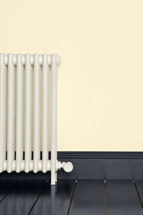
 White Tie is a pretty, traditional white with a yellow base. As a wall colour, it imparts a gentle warmth to any space, with just a hint of black pigment adding a surprising depth. Used alongside other shades from the Farrow & Ball Yellow Based Neutrals, like the darker Matchstick and String, it creates a delicately creamy scheme.
 -
 Wevet is a clean and simple white with cool undertones. Perfect for those looking for a barely-there white, it has a hint of grey that makes it more interesting than a pure brilliant white when used floor to ceiling, but still subtle and easy to live with.
 -
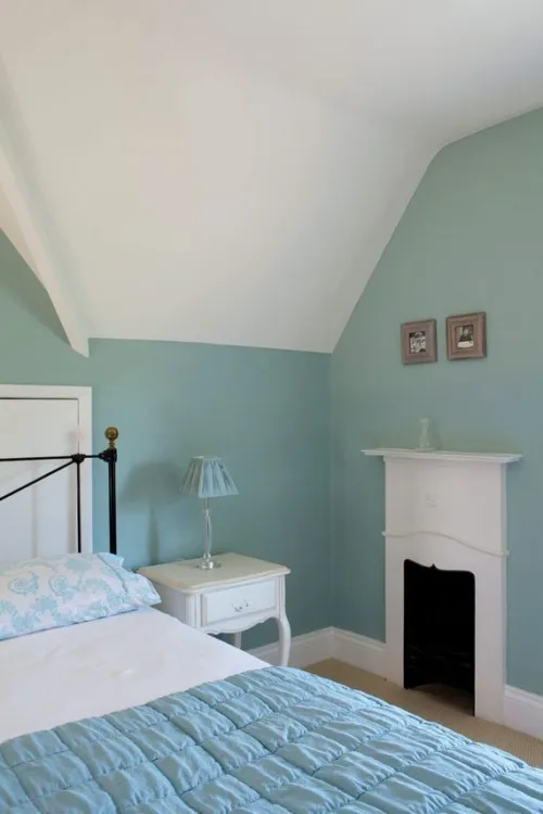
 Teresa's Green has a distinct blue base balanced by green undertones, both of which give the resulting colour an incredibly fresh feel. It has a soft and calming feel that makes it particularly suited to bedrooms and bathrooms, especially when paired with a delicate neutral like White Tie.
 -
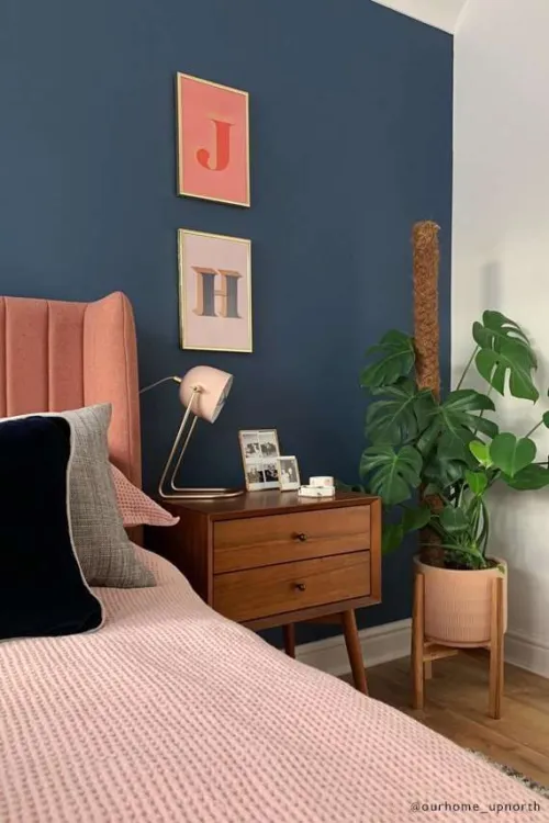
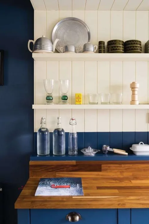
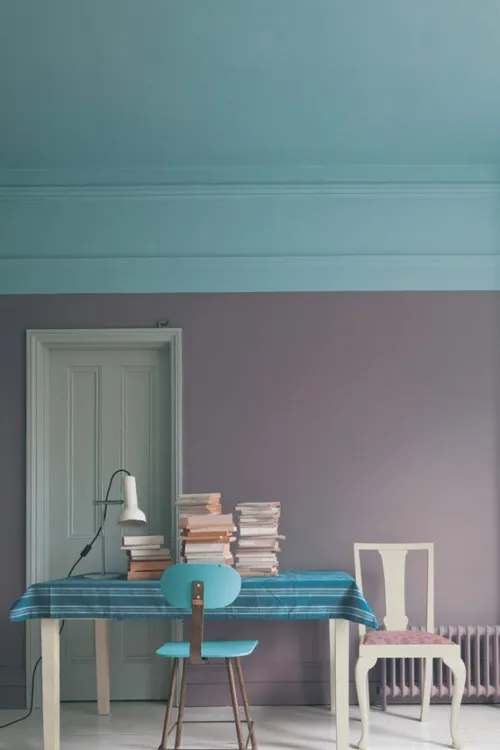
 Stiffkey Blue pronounced 'stoo-key' is inspired by the Norfolk beach of the same name, where the mud is a unique shade of navy blue. In the home, however, it can create a wonderfully traditional feel, especially when used alongside pale grey Ammonite on woodwork.
 -
 Skimming Stone is a light grey with subtle lilac undertones, which give it just the right amount of warmth while still feeling contemporary. Due to its warmer tone, it's a great grey for bedrooms, and makes a wonderful addition to any room alongside Farrow & Ball classic Elephant's Breath, its darker accent.
 -
 Peignoir is a soft pink with a generous dose of grey, making it a sophisticated option for any room of the home. Due to its grey undertones, it works particularly well in a scheme alongside the Farrow & Ball Contemporary Neutrals.
 -
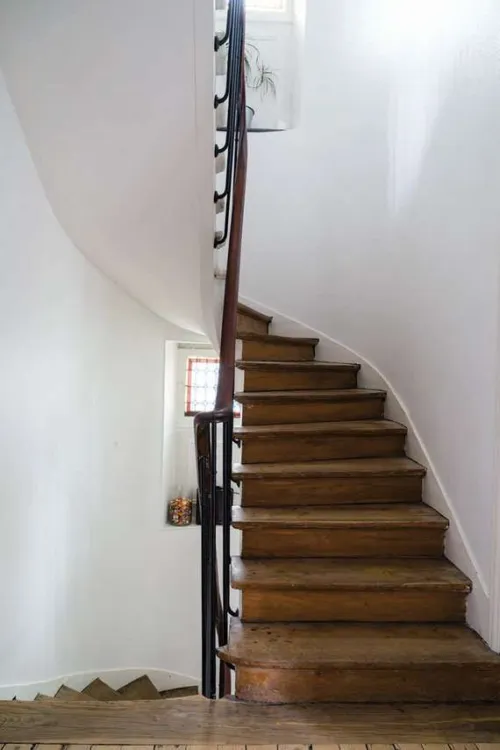
 Joa's White is named after Farrow & Ball's Colour Curator, Joa Studholme. A light taupe with just the slightest amount of black, this versatile shade from the Red Based Neutrals group looks particularly fitting alongside natural materials like leather, linen and stone.
 -
 Jitney takes its name from the Hampton Jitney, the bus that whisks New Yorkers away from the stifling city and towards the sea air of the Hamptons during the summer months. This beachy destination inspired the colour of Jitney a relaxed and effortlessly cool sandy brown.
 -
 Hardwick White is one of the deepest and most grey-toned of the Farrow & Ball whites. Used as a wall colour, it's a sophisticated chalky hue that appears much more grey than white. Contrasted with a strong shade such as Off-Black, meanwhile, it appears much brighter.
 -
 No colour has provoked more debate among Farrow & Ball's followers than Green Blue. It appears differently to everyone and changes colour with the light, adding intrigue to any room but all are sure to agree on its soft, aquatic tones, which are particularly perfect for a relaxing bathroom.
 -
 The first cream to feature in the Farrow & Ball palette is aptly named after the brand's co-founder, John Farrow. A classic wall colour, with no complexity-adding black pigment, Farrow's Cream creates pretty and traditional-feeling rooms. It looks particularly at home in a country kitchen.
 -

 Elephant's Breath is instantly recognisable as a Farrow & Ball shade, both in name and colour. It's a universally popular mid-tone grey with a subtle lilac undertone, which comes more to the fore in cooler light. Try it in a scheme alongside the darker Charleston Gray and London Clay for an effortlessly cool look.
 -
 Brassica is a sophisticated lavender shade with grey undertones, which really come to the fore in darker rooms. It's inspired by the distinctive florets of purple sprouting broccoli, from the Brassica family of plants.
 -
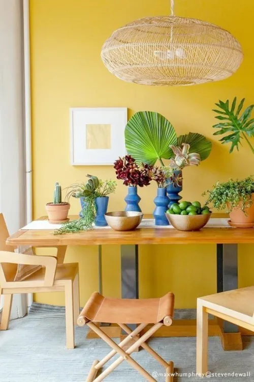
 Babouche takes its name from the flat leather slippers that originated in Morocco, often seen in the same cheerful shade of yellow. For a modern twist, pair bright Babouche walls with the blue-black shade Railings on furniture or woodwork.
 -


A true earthy green
An enticing olive shade, Sap Green is a true celebration of nature and feels wonderfully intense in small spaces. Recommended Primer & Undercoat: Dark Tones Complementary white: Strong White No. 2001 -


A quiet dark stone
A dark, quiet colour that sits effortlessly alongside natural materials, such as weathered wood or flagstone floors. It feels reserved and comforting in equal measure. Recommended Primer & Undercoat: Dark Tones Complementary white: Stirabout No. 300 -


A brown-based deep red
An earthy red inspired by an ancient civilisation. Less intense than Preference Red, it's still undoubtedly rich without being overwhelming. Recommended Primer & Undercoat: Red and Warm Tones Complementary white: Joa's White No. 226 -


A deep ochre
An aged yellow celebrating the ever so familiar cloth used to clean homes worldwide. Recommended Primer & Undercoat: Mid Tones Complementary white: Lime White No. 1 -


A smoky grey-green
Inspired by the soot and tarnished brass of traditional candle snuffers, this is a green interpretation of our beloved Inchyra Blue. Recommended Primer & Undercoat: Dark Tones Complementary white: Shaded White No. 201 -


A clean light blue
This highly requested, cleaner interpretation of Light Blue takes its name from the folkloric fires of Sweden, often decorated in this shade. Recommended Primer & Undercoat: White and Light Tones Complementary white: Strong White No. 2001 -


A familiar terracotta
Inspired by the origins of the word apron, this is a familiar clay colour with a well-loved feel. Recommended Primer & Undercoat: Red and Warm Tones Complementary white: Stirabout No. 300 -


A crisp, blue-based neutral
A fresh neutral with distinctive blue undertones, this colour has a certain crispness like the starch it is named after. Recommended Primer & Undercoat: White and Light Tones Complementary white: All White No. 2005 -


An intense muddied green
The green pigment in this dark neutral has been reduced so much that it's barely there - some see brown, while others see green. Recommended Primer & Undercoat: Dark Tones Complementary white: Old White No. 4 -


A down-to-earth green
Named after the tool beloved by gardeners to create holes for planting seeds or bulbs, this muddied green has a close association with the natural world. Recommended Primer & Undercoat: Dark Tones Complementary white: Slipper Satin No. 2004 -


A softer salmon hue
This lighter interpretation of Dead Salmon is inspired by both the soft hue and gentle, curved shape of the prized shellfish. Recommended Primer & Undercoat: Mid Tones Complementary white: Dimity No. 2008 -
 This clean mid green is named in honour of a kind and generous member of our Farrow & Ball team who is sadly no longer with us. A dependable, uncomplicated colour, with the ability to feel even greener in bright daylight or more conservative in lower light. This shade is a beautiful addition to any home.
 -
 Our most spirited red, the name of this fiery hue was originally used to describe the deceit of pirates. Full of buccaneering spirit, Bamboozle brings joy and warmth to any room scheme and is easy to use in both traditional and modern homes. It will hold its own in any light and pairs brilliantly with other strong colours, like Beverly and Wine Dark.
 -
 Inspired by midnight skies, this spiritual colour is named after the term Homer used to describe the sea. Our richest blue, it's the perfect addition to our strong blue family, being more sophisticated than Stiffkey Blue and more upbeat than Hague Blue. In low-light, Wine Dark becomes even richer, making it particularly glamorous in candlelight and perfect for creating intimate spaces.
 -
 For an upbeat space, try this lively green. A lighter version of Breakfast Room Green, Whirlybird is inspired by the papery winged seeds beloved by many playful young gardeners and nature lovers. It looks particularly lively in morning light and is complemented by Beverly and James White.
 -
 A historic-feeling pink, this shade was developed for the dining room at Templeton House to offset the magnificent Wedgwood plaques made to commemorate the former owner, although it suits a contemporary setting just as well. A more intense version of Setting Plaster or Pink Ground, it creates a warm, welcoming space, particularly in low light where this shade becomes surprisingly deep.
 -
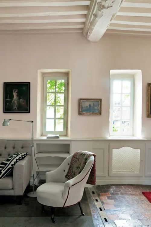
 The lightest and most delicate of our pinks, this charming colour is that of the tacking thread used in Haute Couture ateliers. It may be delicate but it's strong in character and has enough colour contrast with white. Perfect paired with vintage finds or industrial accents, this shade works well in both traditional and modern schemes.
 -
 A lighter, less grey version of popular De Nimes, Selvedge is named after the highly prized denim woven on a shuttle loom to produce closed edges. It's particularly good in low-light spaces, creating a familiar and friendly atmosphere, making it suited to bedrooms or rooms you spend time in, in the evening. It pairs beautifully with accents of darker colours like Inchyra Blue or Hopper Head.
 -
 This clean cool blue is inspired by the wings of seabirds when seen in bright sunlight. Sitting between Parma Gray and Lulworth Blue, Kittiwake has a touch more black pigment creating a warmer, more relaxed feel. This shade is perfect for living spaces, staying truly blue in all lights. It also complements stainless steel especially well, so is ideal for contemporary kitchens. A sophisticated blue, it looks fantastic with Wine Dark and Borrowed Light.
 -
 Sitting between the ever-popular Railings and Down Pipe, this classic charcoal colour is inspired by the attractively designed iron containers used to catch rainwater at the top of a downpipe. Ideal for creating inviting spaces, Hopper Head works beautifully with nearly any Farrow & Ball shade or can be used exclusively across walls, woodwork and the ceiling for a dramatic space.
 -
 A gentle green named after the circular currents enjoyed by wild water swimmers as a natural jacuzzi. This evocative colour creates a seamless connection with nature, perfect for use in a garden room or alongside natural materials. A breath of fresh air, Eddy is also an ideal choice for calm, relaxing spaces. It is delicate in tone without crossing into pastel and sits at the lightest end of the French Gray and Treron family.
 -
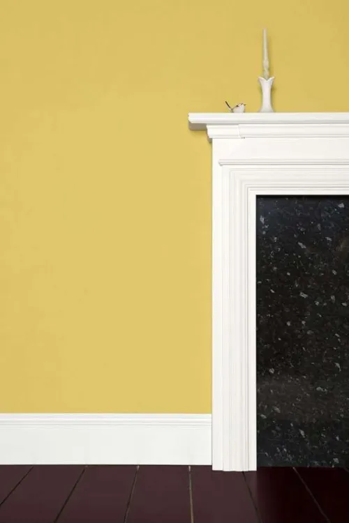
 Yellow Ground was originally used as a background colour to Farrow & Ball wallpapers, and today is one of its most popular yellows. Lighter than Sudbury Yellow and warmer than Citron, it's a true sunny yellow that creates discernibly happy spaces without ever feeling overpowering.
 -
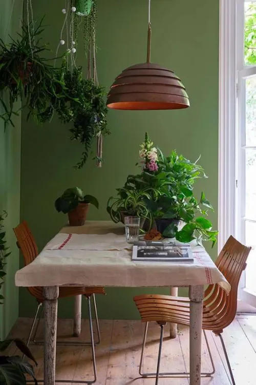
 Yeabridge Green is a fresh mid-toned green. It's based on a colour found at an 18th-century farmhouse in Somerset, which was still lush and bright on its discovery despite being many years old. Less yellow than Churlish Green and more so than Breakfast Room Green, it offers the best of both worlds.
 -
 Worsted is a woven fabric named after the Norfolk village where it was originally made. Farrow & Ball's own Worsted takes its colour from the suits often made from this material, most often in deep shades of grey. It's lighter than Mole's Breath, but deeper than Purbeck Stone, and makes a great accompaniment to both.
 -
 Vert De Terre is inspired by the 'green earth' pigment often used as a base for flesh tones in medieval portraiture. It has a slight blue undertone that sets it apart from the warmer Cooking Apple Green and greyer Ball Green, while also giving it a soft and soothing feel.
 -
 Vardo takes its name from the ornate horse-drawn wagons once commonly used by Romanichal Travellers across Britain, which often used vibrant tones such as this rich teal in their decoration. Make it the star of any scheme by teaming with subtle pale greys such as Ammonite or Strong White.
 -
 Treron is a sophisticated dark grey-green shade. A greener alternative to Farrow & Ball favourite Pigeon, it aptly takes its name from a green-breasted genus of the pigeon family. Try it as an accent to French Gray or lighter shades in the Farrow & Ball Traditional Neutrals group.
 -
 Tanner's Brown is a strong dark brown that can appear almost black in certain lights. It's a great alternative to a pure black to create a lower-contrast look, especially in well-lit rooms where its warm red undertones become more apparent.
 -
 Tallow is a creamy yellow-based white, taking its name from the natural material once used to make soaps and candles. Its underlying pink and yellow pigments give it a warm and reflective quality that helps to make the most of any available light.
Paint, Wallpaper and Decorating Supplies
From premium paint to stylish wallpaper, we’ve got everything you need to transform your space. For more than 20 years, P.V. Macari Interiors, based in Co. Armagh, we’re built on quality, value and service — trusted by pros and DIYers alike. As a family‑run business, we combine top‑quality products with genuine expertise to help you achieve the perfect finish.
Get Exclusive Discounts
Join our list for exclusive offers, early access to promotions, and helpful project inspiration.
We treat your information with care to keep it secure, and you can opt out at any time.
Copyright P.V. Macari Interiors
My Account
About & More
Payment
Checkout Powered by
