Small Space Styling: Solving Narrow Interiors with Light & Colour
Why Narrow Spaces Feel Boxed In
Small rooms, hallways, and utility areas often get overlooked in styling—and quickly become functional zones with no design attention. Clutter, poor light, and low ceilings all contribute to a space that feels tight and stressful rather than clear and usable.
Why Pale Colours Work
Light tones bounce natural and artificial light around a room, making it feel larger and more breathable. Farrow & Ball’s off-whites are especially effective because of their complex undertones, which shift subtly throughout the day—adding depth without heaviness.
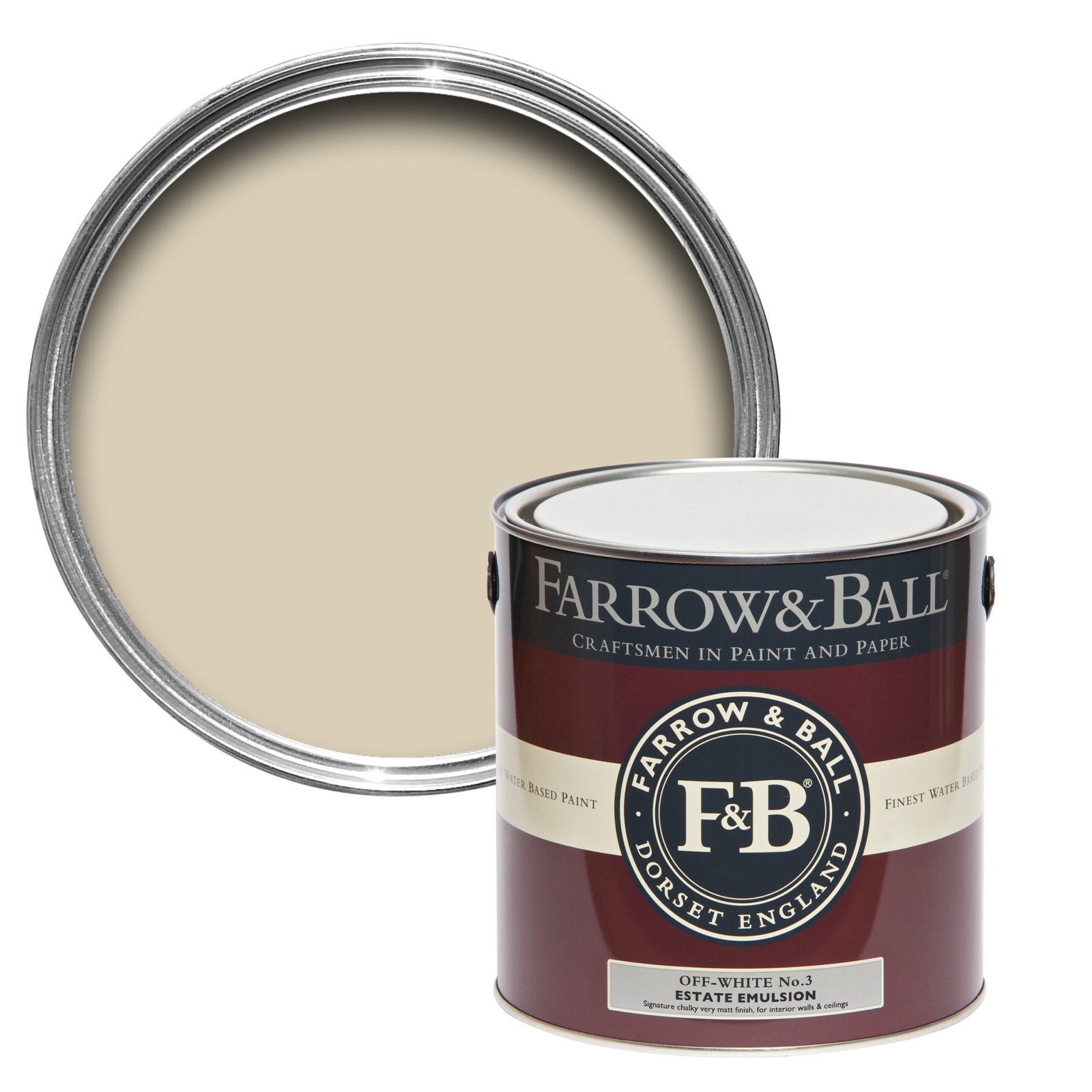
Off-White No. 3
A chalky mid-tone with subtle green undertones
Style it with: Lime White or Slipper Satin for tonal depth
Best for: Woodwork, floors, and transitional space
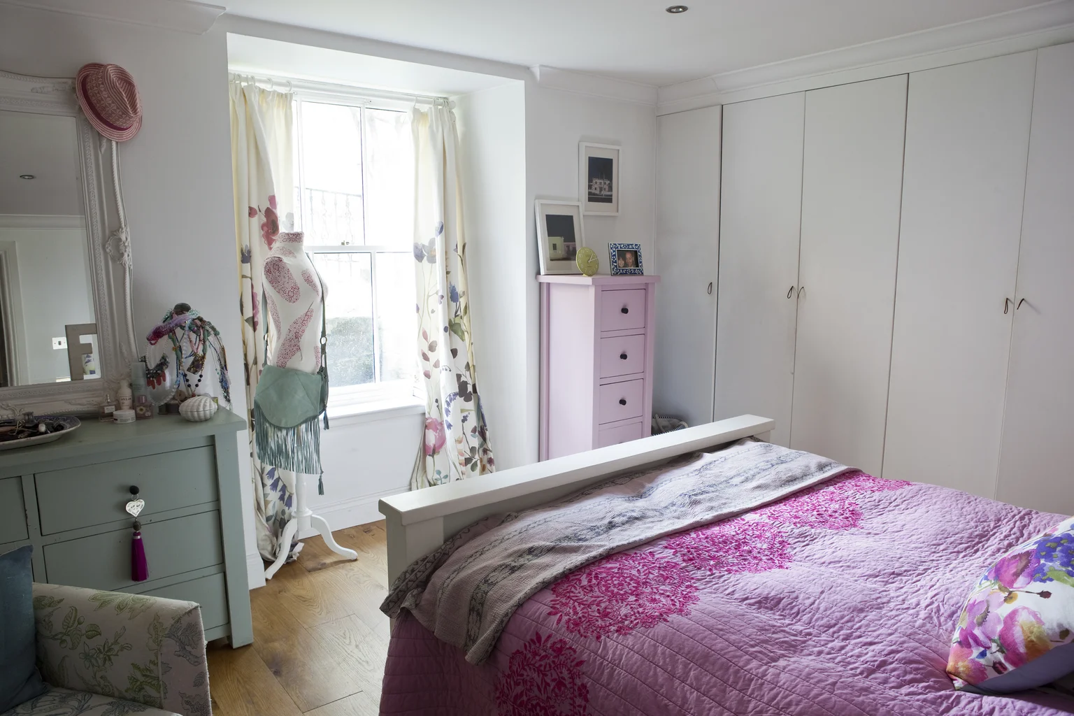
Calamine No. 230

Calamine No. 230 lends a soft blush to this restful bedroom—its muted pink tone adds warmth without overwhelming, perfect for creating a cosy, cocoon-like retreat.
A delicate pink with a soft grey undertone
Style it with: Strong White or Skimming Stone for a grounded contrast
Best for: Powder rooms, nurseries, or north-facing corners
Pointing No. 2003

Pointing No. 2003 adds gentle warmth to the upper walls and ceiling of this bathroom—its creamy undertone softens the light and lifts the room without overpowering crisp tiles or fixtures.
A warm white with red undertones
Style it with: Pale woods and brass for a cosy, sunlit feel
Best for: Kitchens, utility rooms, and cottage-style spaces
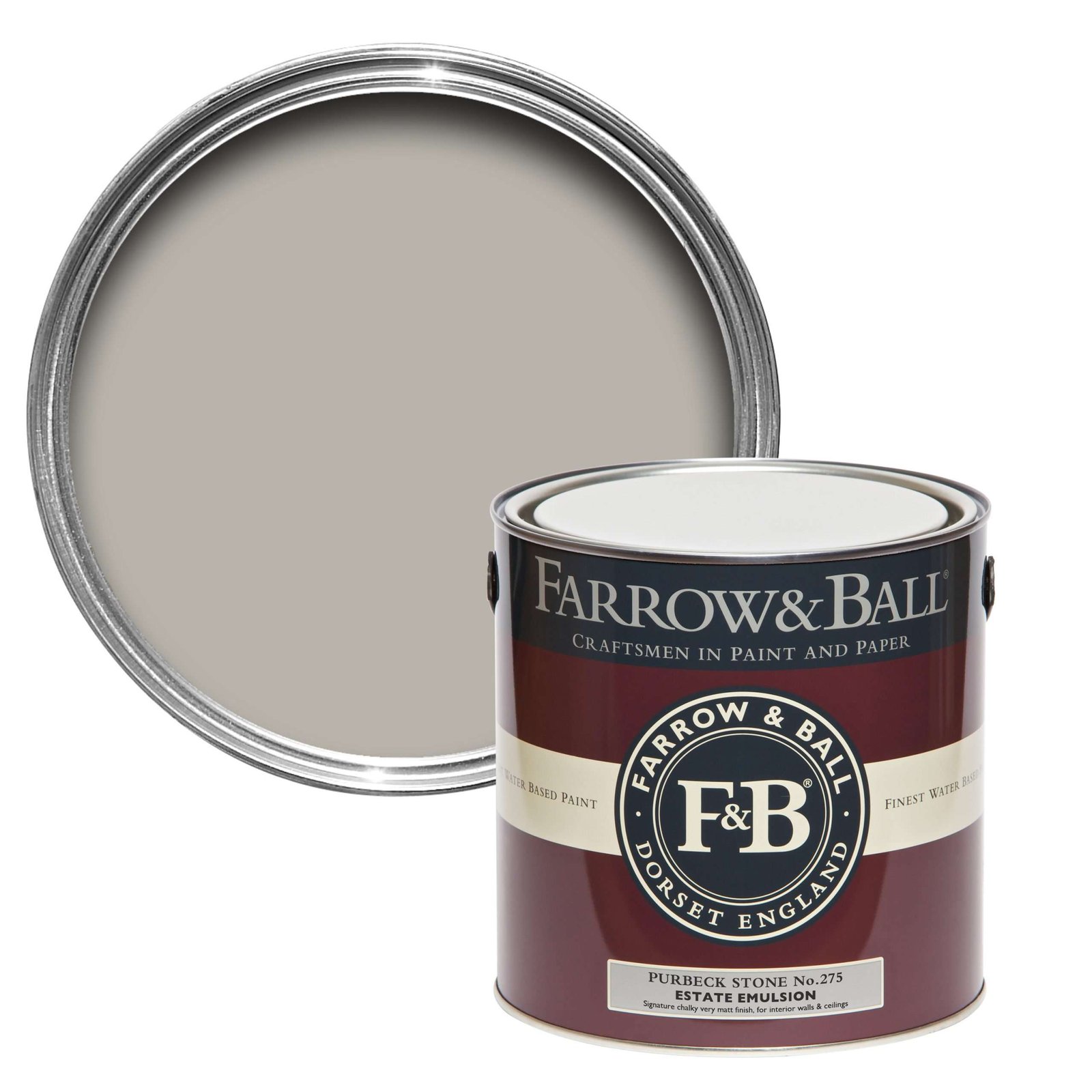
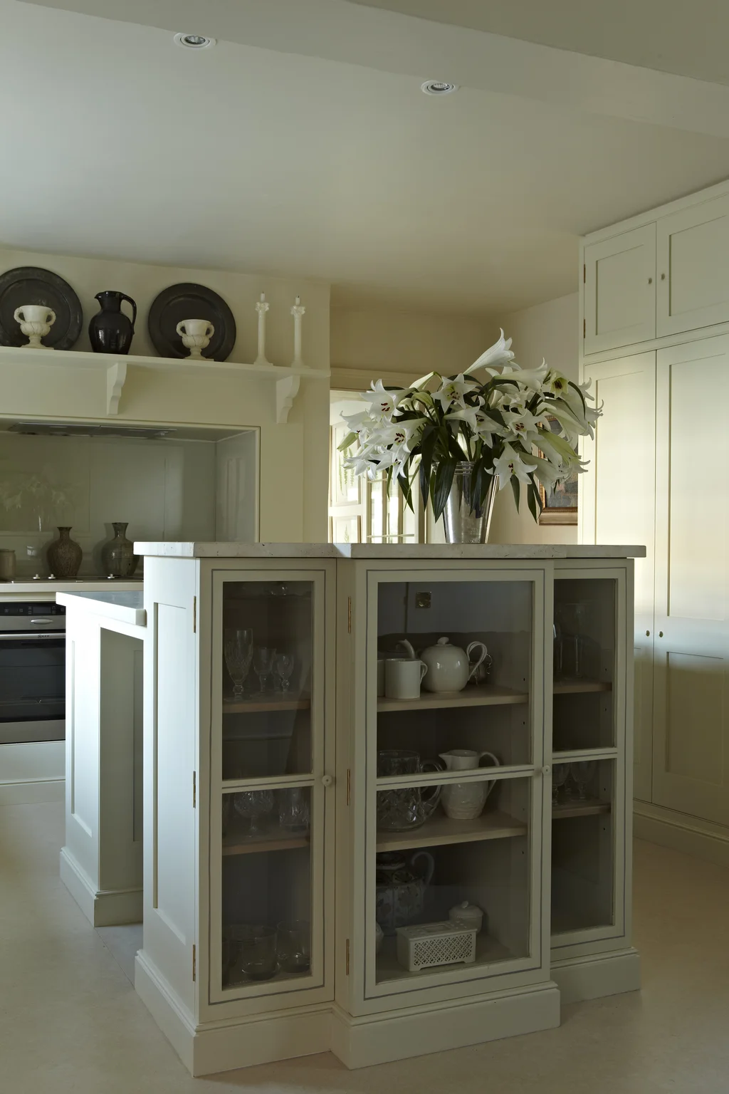
Purbeck Stone No. 275

Purbeck Stone No. 275 lends quiet structure to these panelled cabinets—its soft mid-grey keeps the space feeling open yet grounded.
A clean, understated mid-grey
Style it with: Strong White or Ammonite for tonal depth
Best for: Bathrooms, stairwells, and modern hallways
School House White No. 291

School House White No. 291 offers a soft, comforting backdrop in this child’s bedroom—timeless and grounded, it lets toys and textiles bring the colour.
A soft off-white with a relaxed, lived-in feel
Style it with: Earthy tones like Stirabout or Drop Cloth for gentle contrast
Best for: Bathrooms, laundry nooks, and minimalist bedrooms
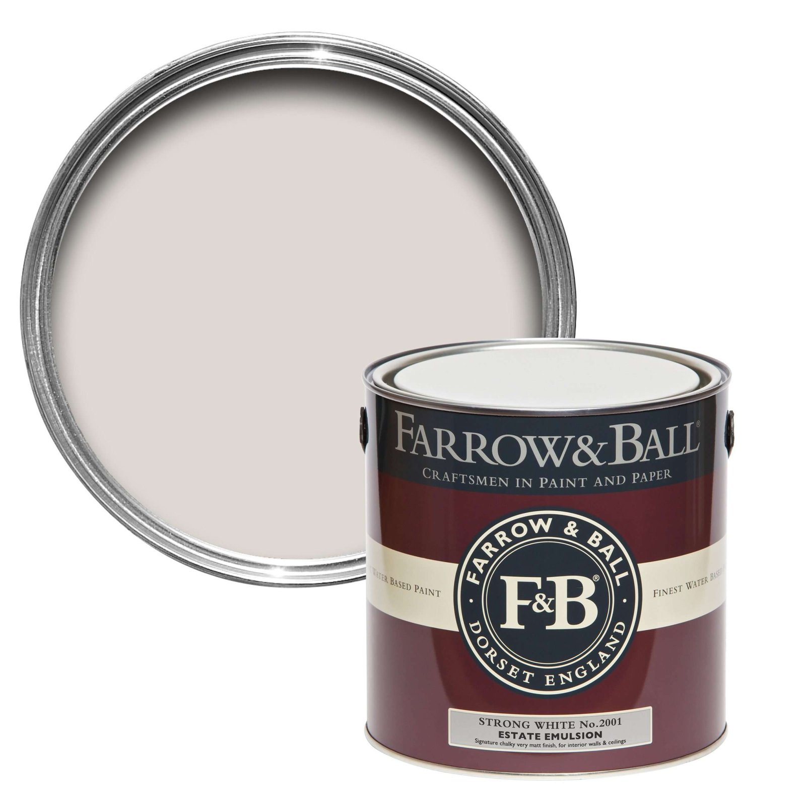
Strong White No. 2001

Strong White No. 2001 brings crisp clarity to this living-dining space—its soft grey undertone adds modern elegance while keeping the room airy and cohesive.
A cool, architectural white with a hint of grey
Style it with: Purbeck Stone or Cornforth White for a layered neutral scheme
Best for: Contemporary spaces, ceilings, and trim
All White No. 2005
A clean, pure white with no undertones
Style it with: Any colour—acts as a perfect ceiling or trim companion
Best for: Ceilings, small corridors, and modern spaces
Styling Tips
- Ceiling trick: Paint ceilings in All White or School House White to visually lift height
- Floor continuity: Use pale flooring or rugs to avoid visual breaks
- Mirror placement: Position mirrors opposite windows to double light
- Minimal trim contrast: Keep skirting and architraves in similar tones to walls for seamless flow
Bringing Light to Life in Tight Spaces
Together, these pale tones form a quiet toolkit for visual clarity. Whether you’re refreshing a stairwell, easing tension in a utility area, or opening up a narrow hallway, Farrow & Ball’s nuanced off-whites do more than just brighten—they bring comfort, cohesion, and composure to overlooked corners. With thoughtful styling and the right foundational shades, even the smallest spaces can feel effortlessly expansive.
| Colour Name | Description |
|---|---|
| All White No. 2005 | Pure, clean white with no undertones |
| School House White No. 291 | Soft off-white with a relaxed warmth |
| Slipper Satin No. 2004 | Chalky off-white with a grey tint |
| Pointing No. 2003 | Warm white with red undertones |
| Off-White No. 3 | Mid-tone with subtle green undertones |
| Strong White No. 2001 | Cool white with a hint of grey |
| Calamine No. 230 | Soft pink with grey undertones |
| Purbeck Stone No. 275 | Clean, understated mid-grey |
| Skimming Stone No. 241 | Warm, taupe-toned neutral |
| Ammonite No. 274 | Subtle grey with a warm softness |
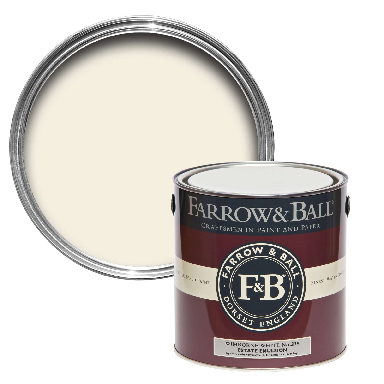
| Wimborne White No. 239 | Creamy white with a touch of yellow |
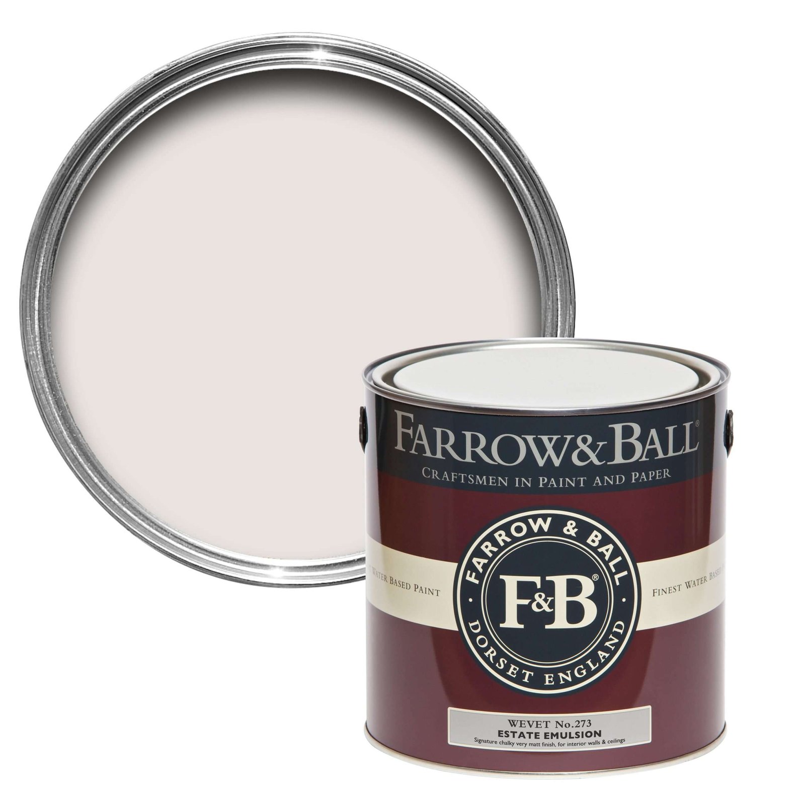
| Wevet No. 273 | Delicate white with a hint of grey |
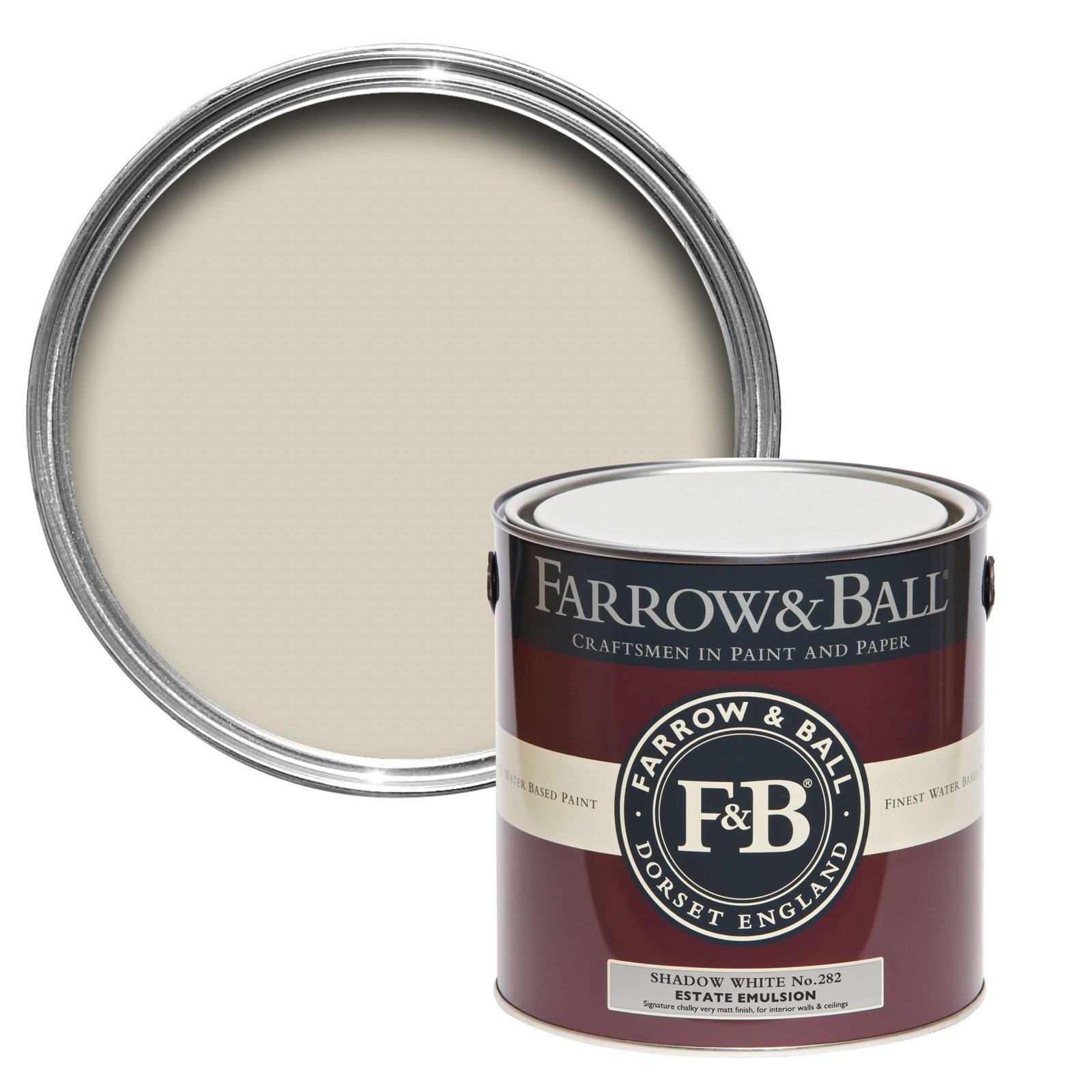
| Shadow White No. 282 | Soft white with a muted beige undertone |
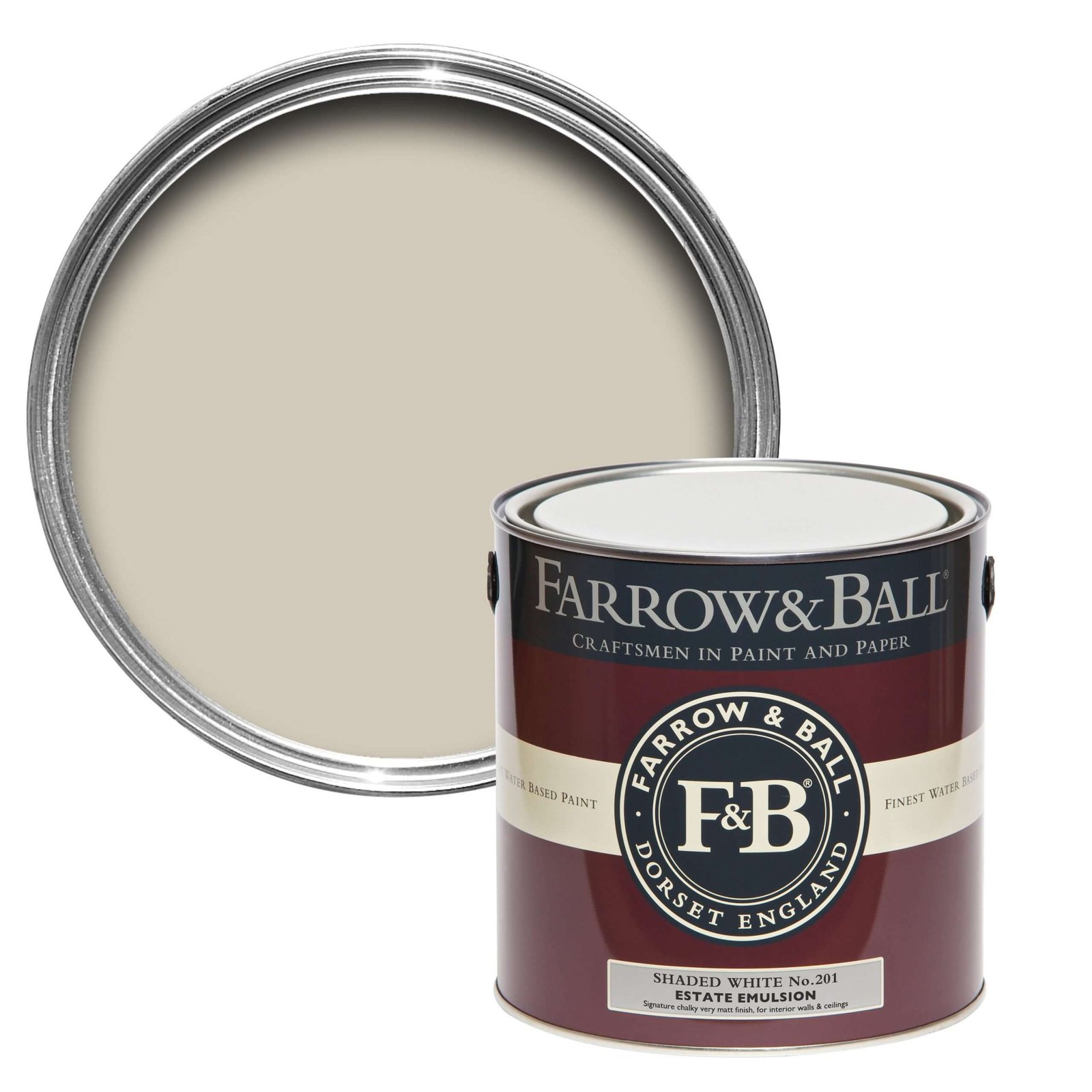
| Shaded White No. 201 | Warm neutral with a grey-beige balance |